WOLFINGTON BODY COMPANY
VEHICLE WRAP / CASE STUDY
WOLFINGTON BODY COMPANY
VEHICLE WRAP / CASE STUDY


Wolfington Body Company specializes in the sale, distribution, and maintenance of buses. When it came time to update the wrap on their EV service van, they requested a refreshed design that retained key elements of the previous version while simplifying the overall look.


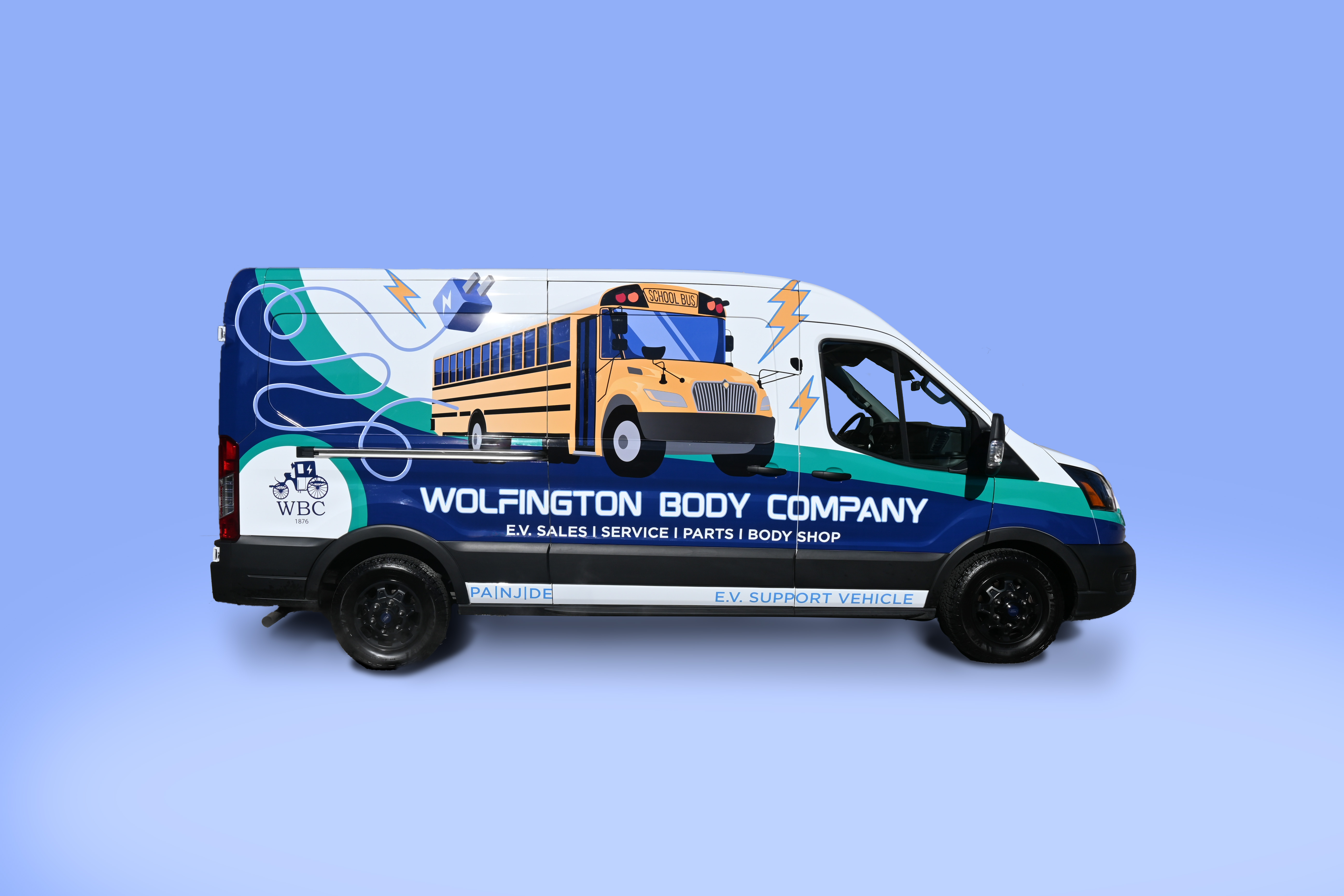
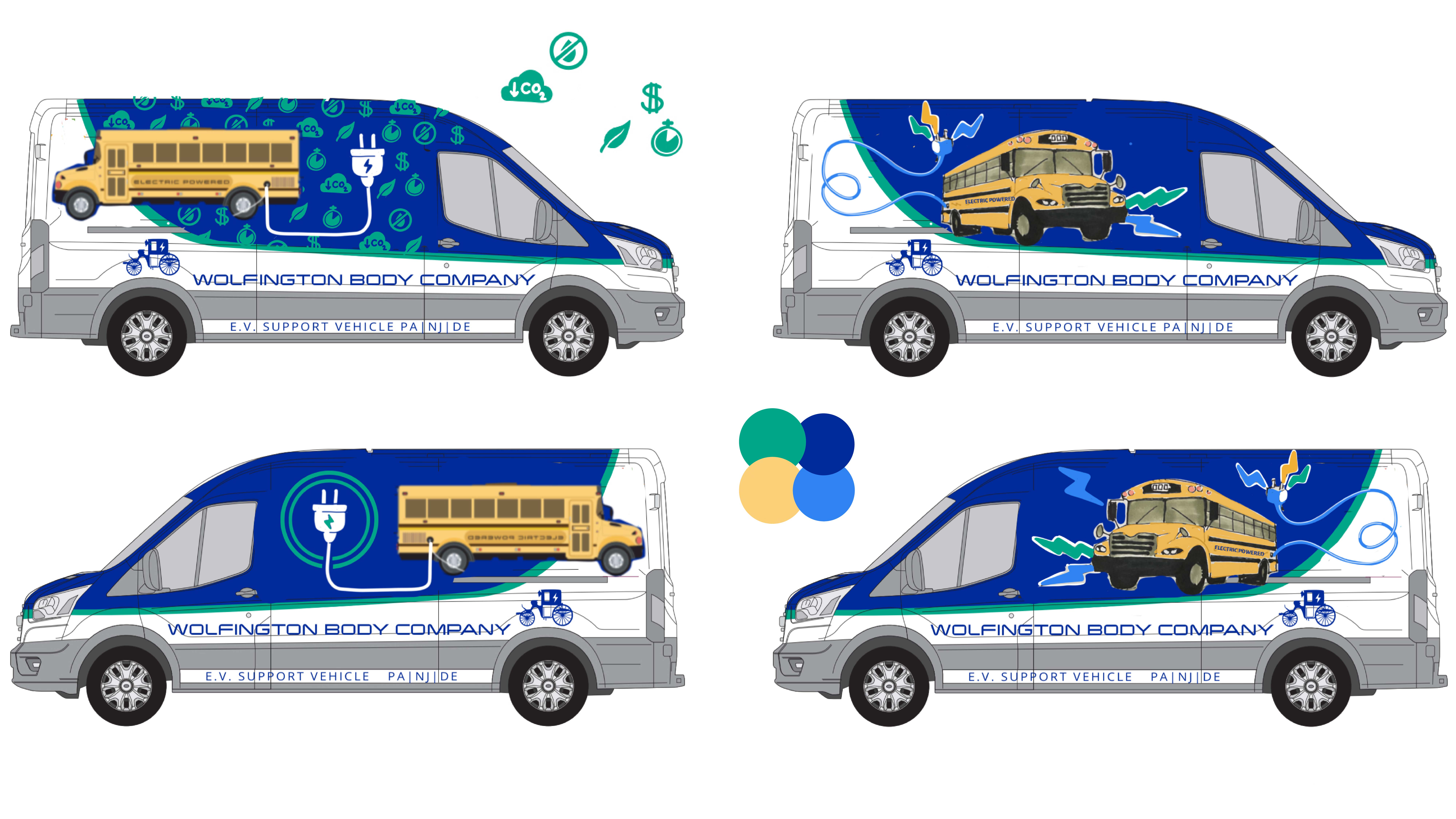
The message to convey remained the same: Wolfington offers electric school buses. They wanted to keep the general placement of information and the composition of the background—specifically the green line that runs down the side—but wanted to cut back on the amount of text and visual clutter. Additionally, they were interested in custom illustrations that better represented the buses they offer.


To immediately communicate that the buses are electric, I emphasized the charging plug, which remained consistent across all my concept proposals. Initially, I used the old bus illustration to save time but eventually became bored with its flat perspective. A quick sketch of a bus at a more dynamic angle revealed that a two-point perspective is what the design needed to boost its energy (pun intended).

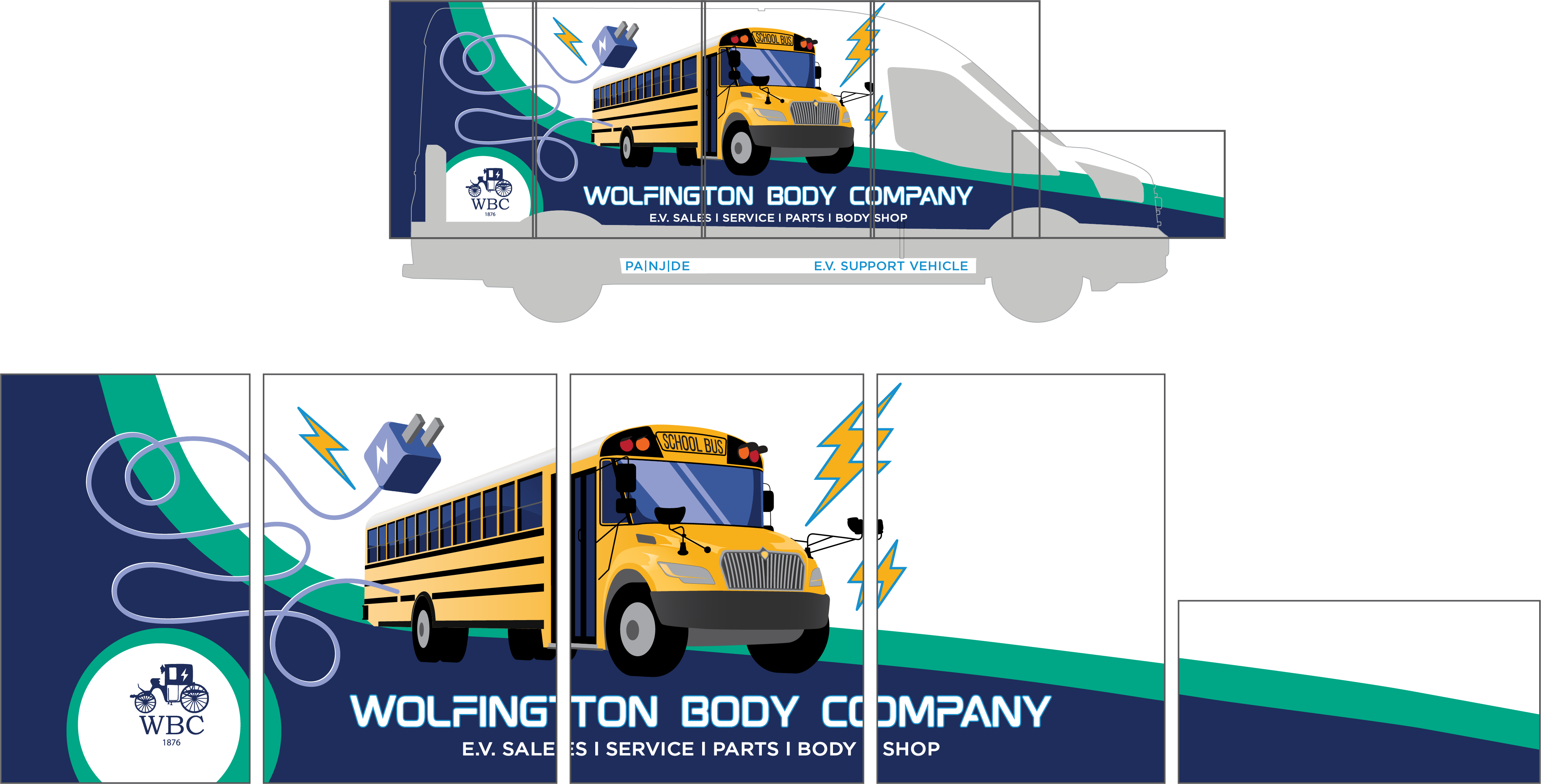
Maintaining a similar background composition, I flipped the placement of blue and white to make the illustration stand out and prevent clashing colors. This choice was also practical: since the vehicle’s base color is white, it saves us from needing to wrap the top of the vehicle. Not only does this cut down on material and labor costs, but also improves durability, as the hood’s constant sun exposure can weaken the vinyl over time. Lastly, I changed the shade of blue from a bright, electric tone to one from Wolfington’s brand guide, ensuring consistency with their established identity.


