

Sticky Fingers
TOYS & GAMES / CASE STUDY

Sticky Fingers is a 2-4 player, fast-paced, table-top card game where participants play as one of four zany amphibians and race against each other to play the most cards into the Swamp. The first player to drain their Pond pile calls out “CROAK” to end the round, cutting off their opponents from scoring more points. Points are tallied at the end of each round until one player accumulates 72 points and is crowned winner. The gameplay for Sticky Fingers is derived from “Dutch Blitz,” a card game developed in Pennsylvania Dutch country in 1937. The original game is composed of 4 decks with 40 cards each, numbered 1-10 in four different colors. The separate decks are distinguishable by the designs on the back of the cards: pale, plow, pump, and carriage. Due to this unique composition, the game can only be played with the official Dutch Blitz cards, or by making your own by omitting the face cards from 4 traditional card decks, until now…
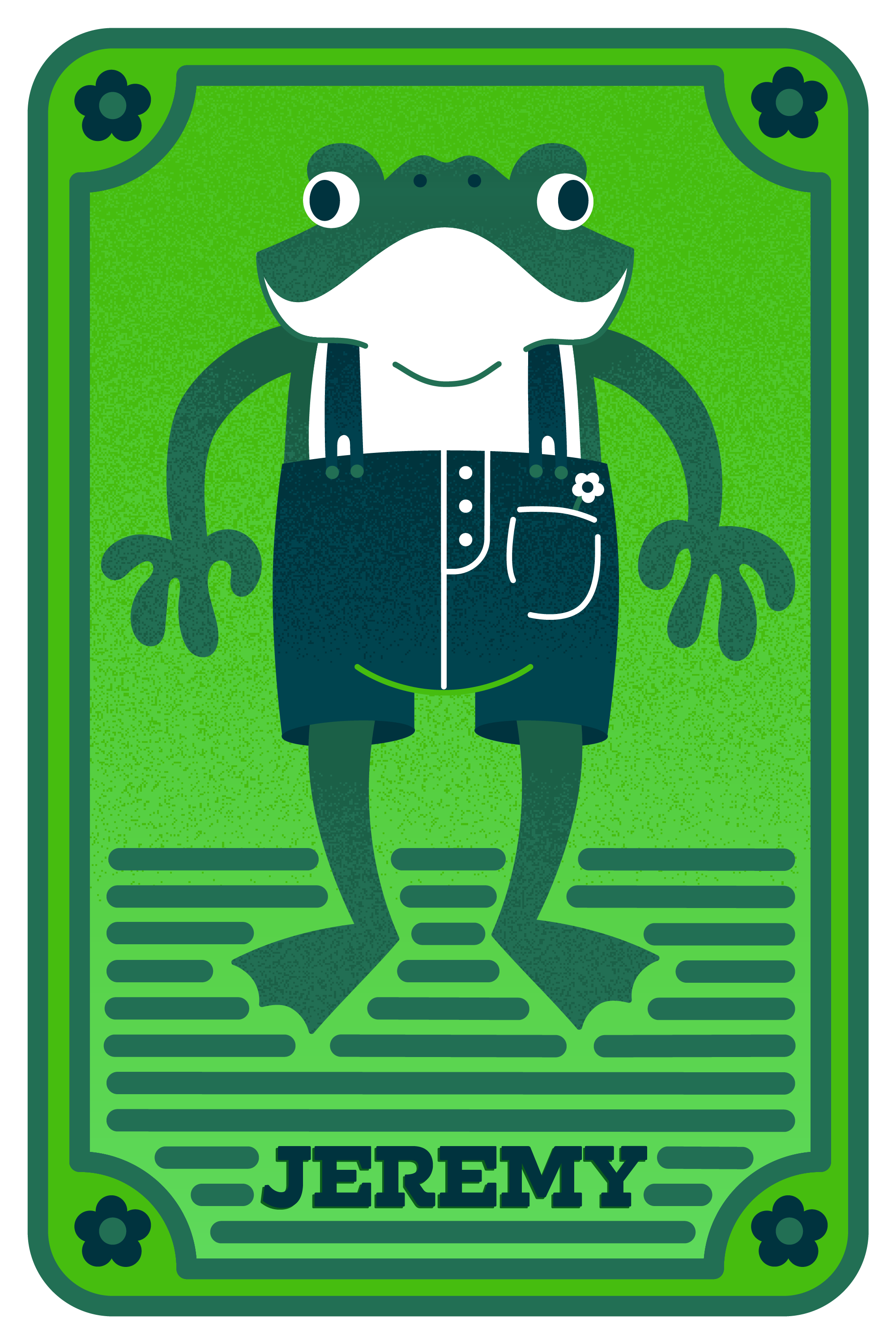
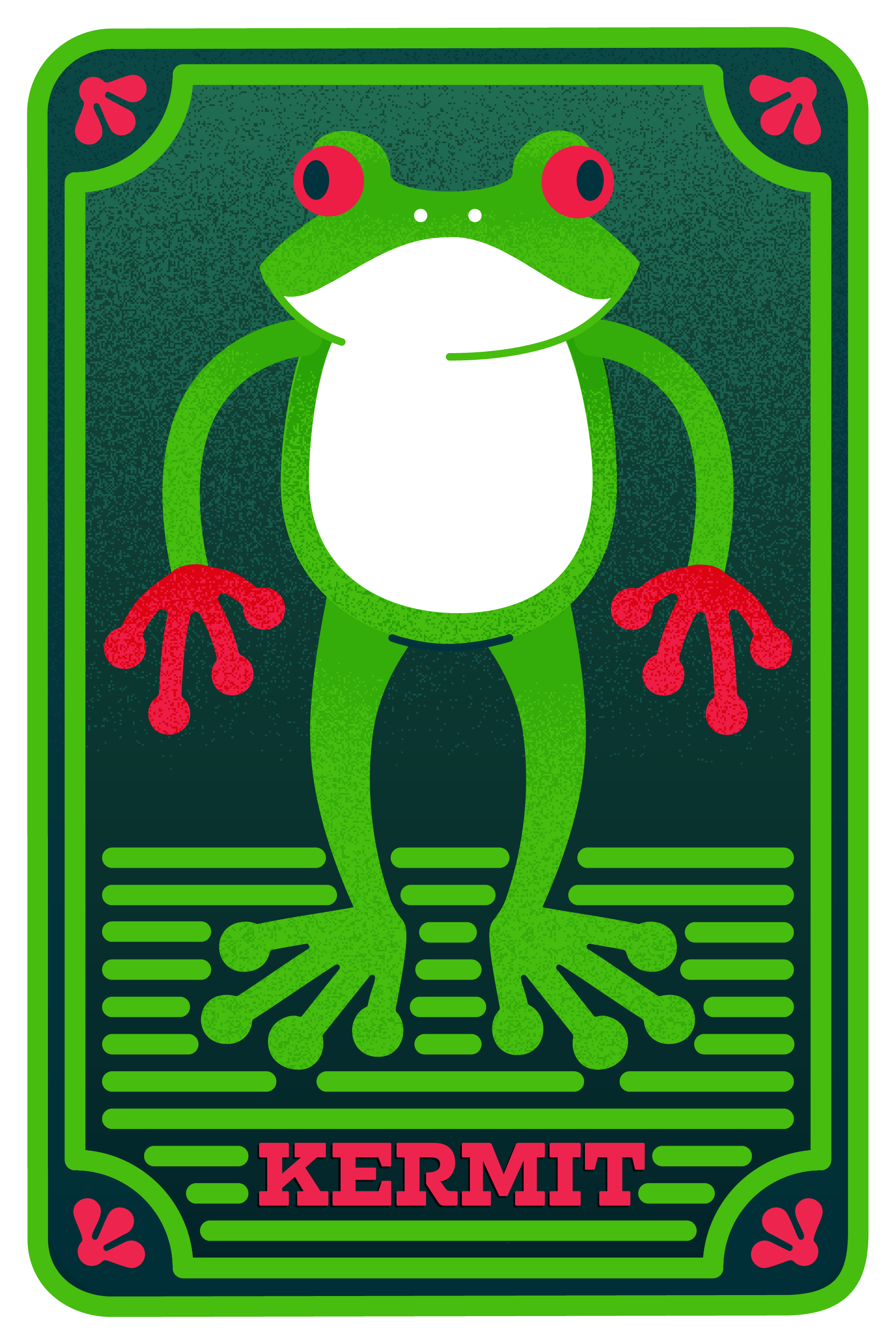
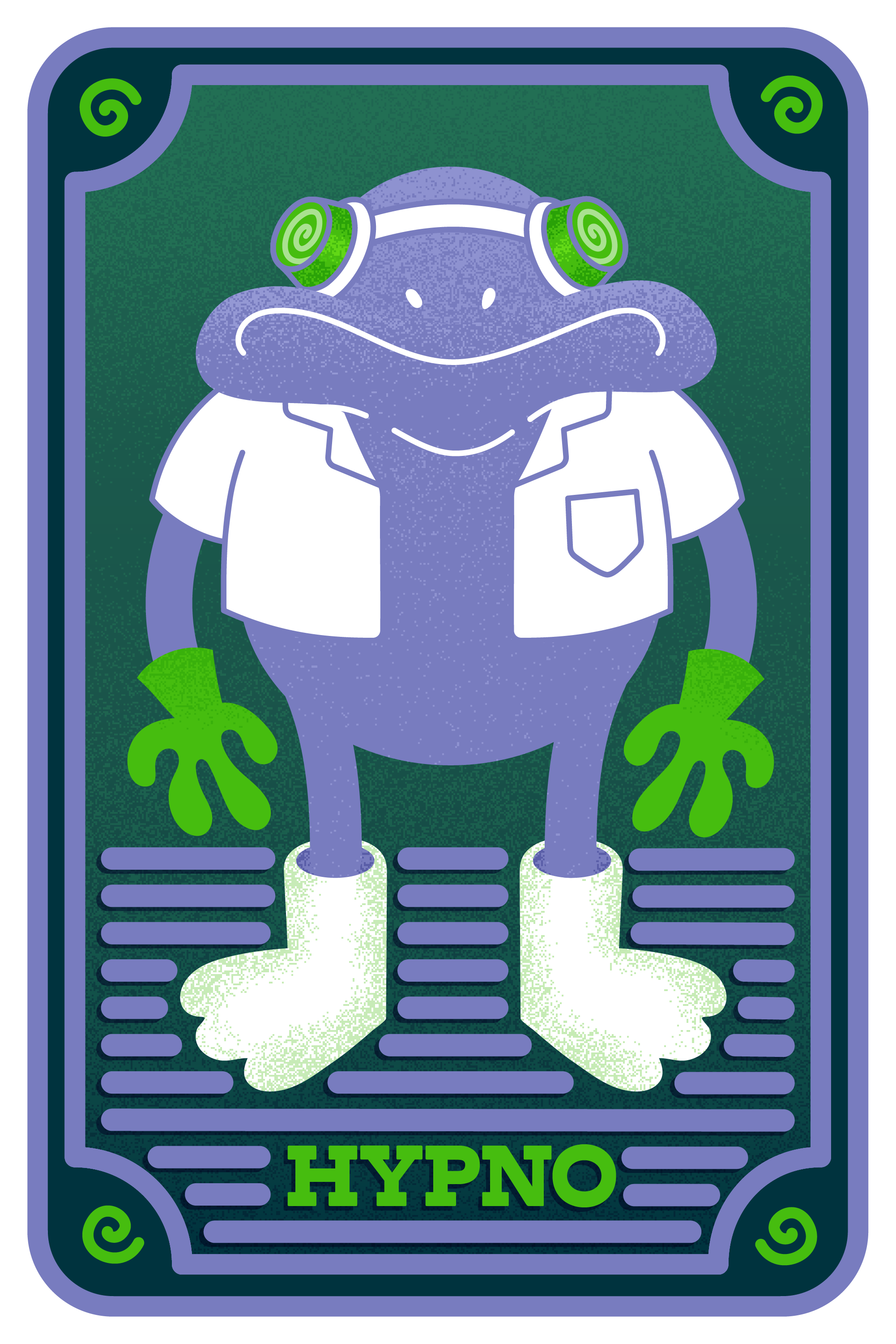
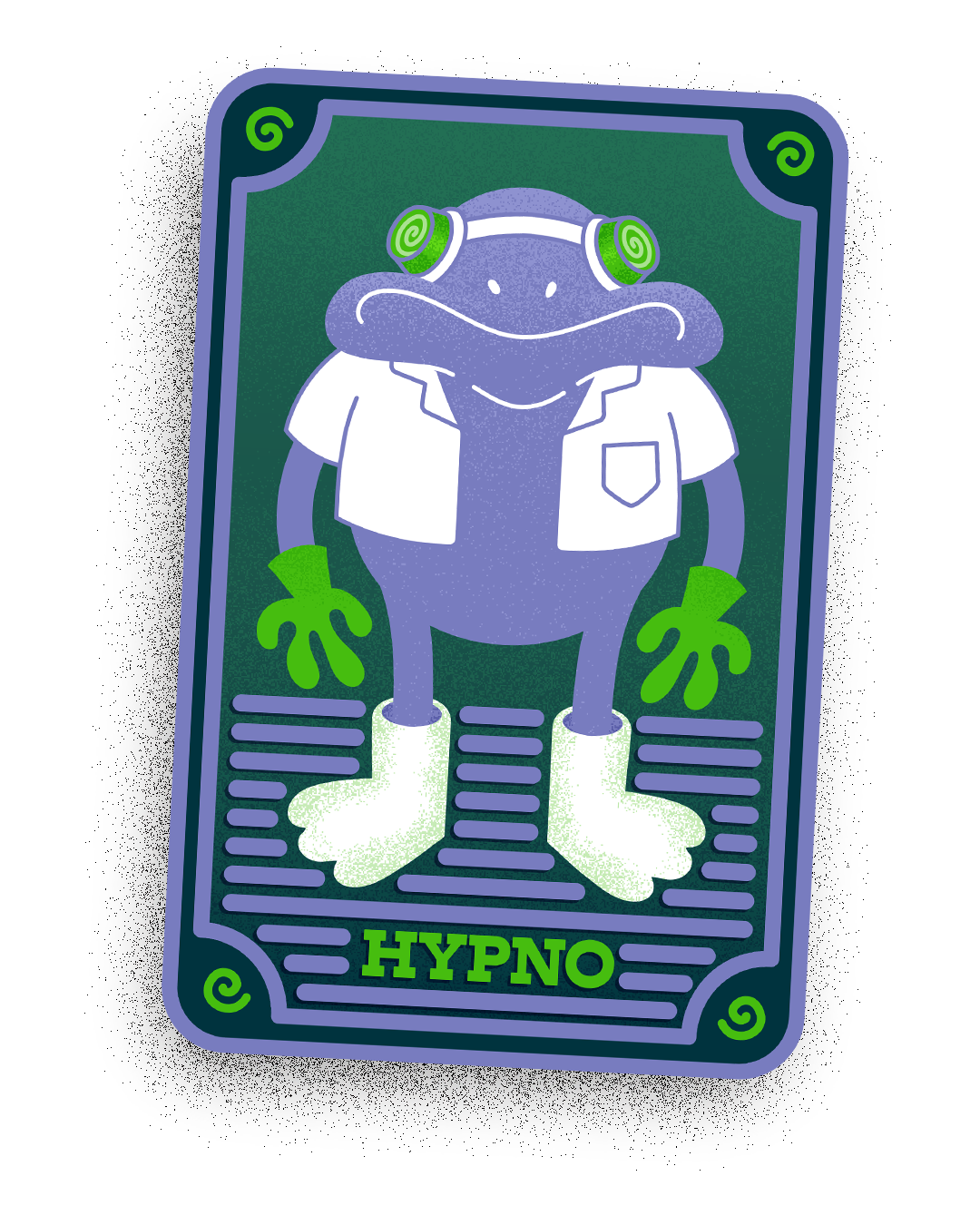
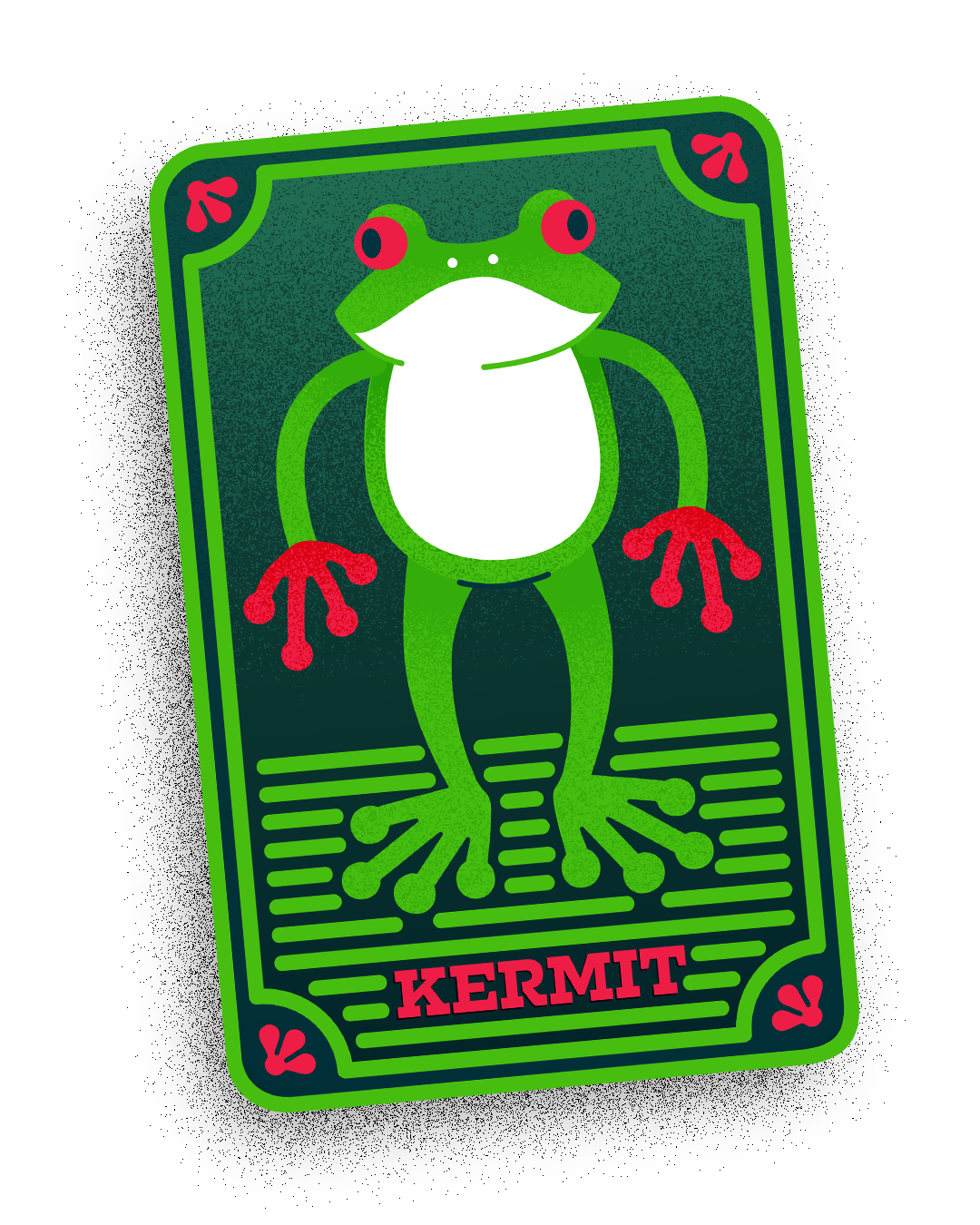
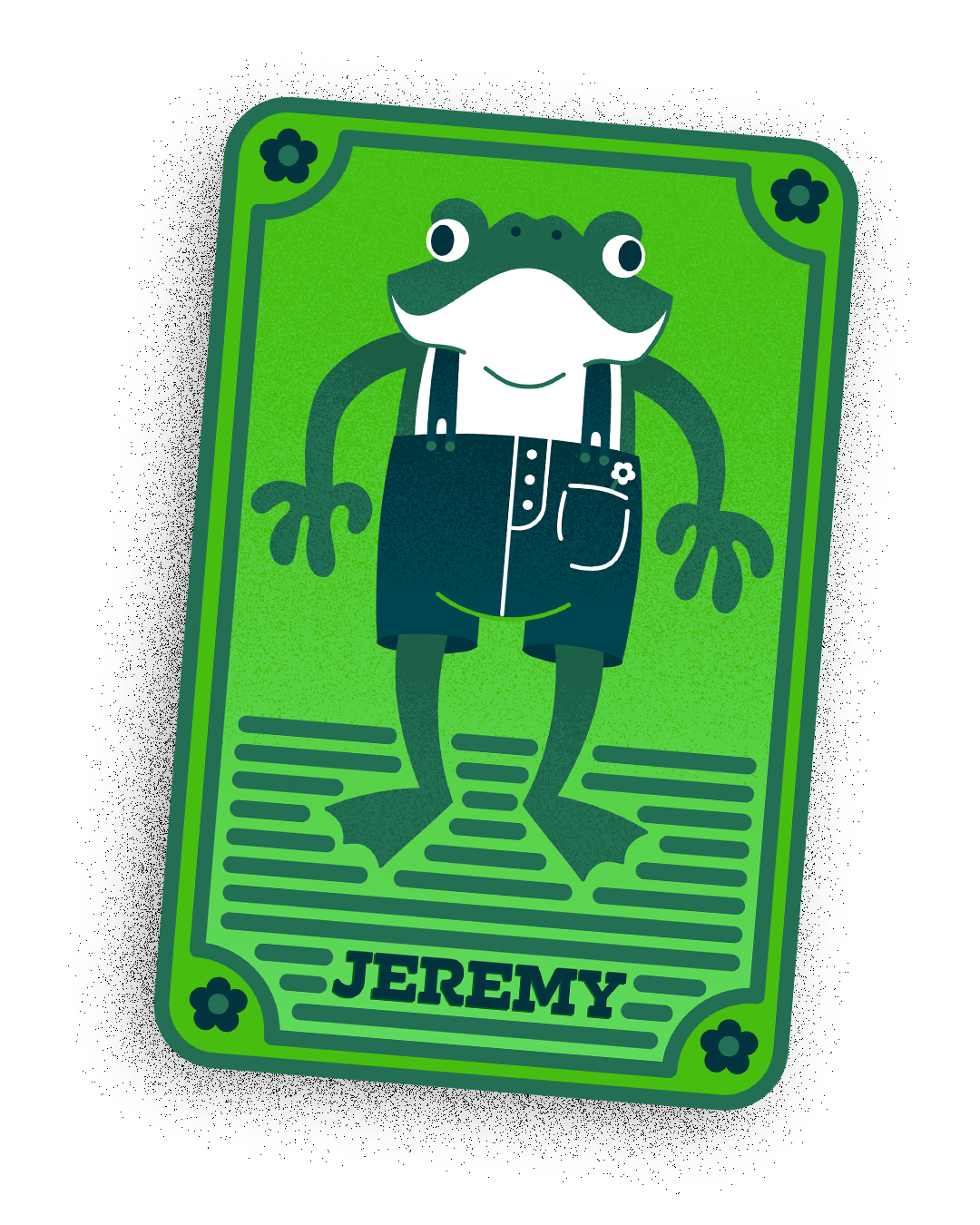
Dutch Blitz is a beloved favorite for family gatherings because it is simple enough for younger family members, yet exciting and engaging for all ages. While many Dutch-Blitz veterans have grown to love the weirdly niche theme, I decided the game could use some reframing, to freshen up the design and make the elements in the game more relevant. In addition to designing the faces of the cards, I needed to create four different designs for each deck, which helps players sort their cards at the end of each round. Since players use their own deck of cards, I decided that the four designs should represent a character, like an avatar for the player.
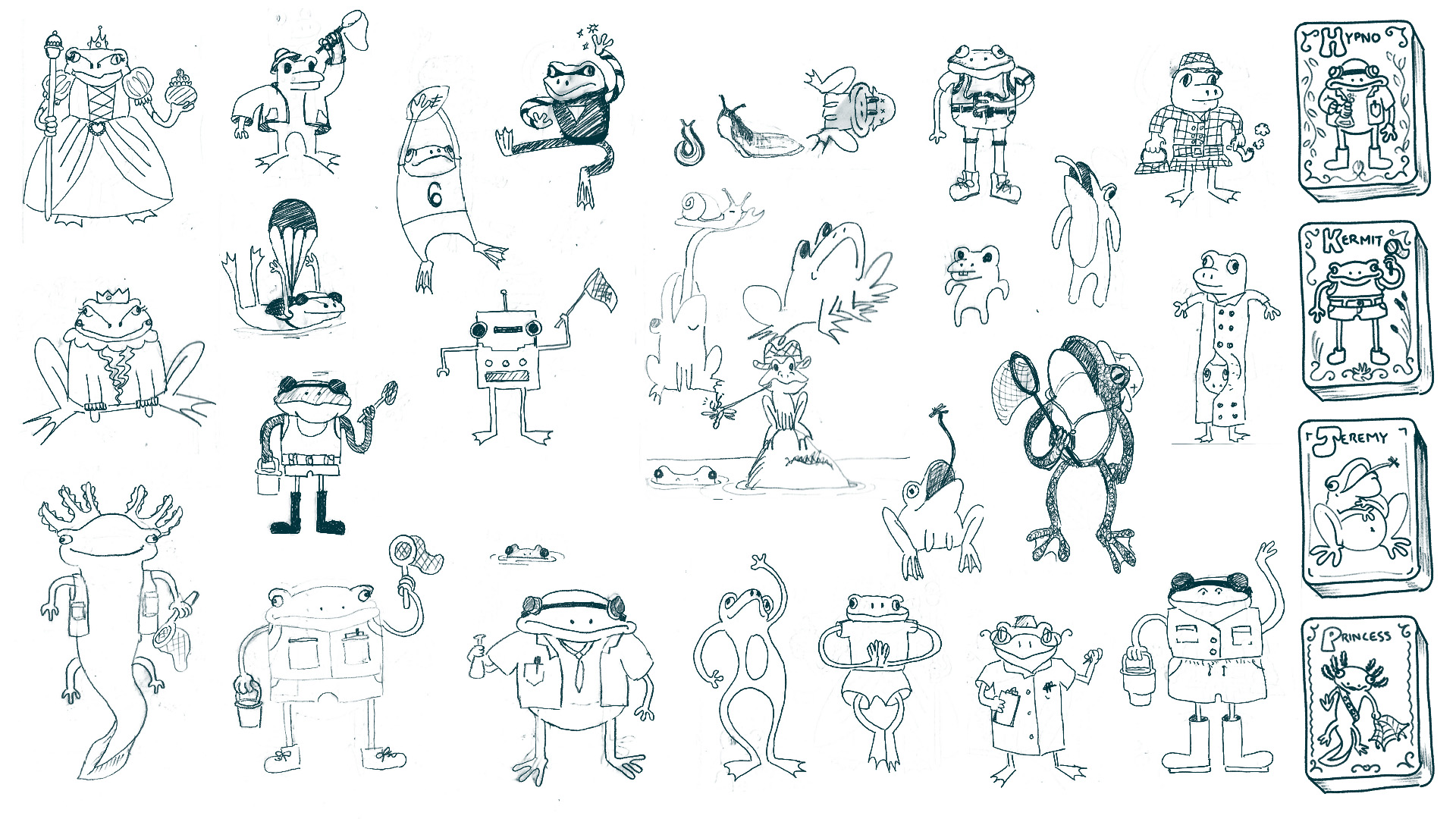

I knew the parts I wanted to improve about Dutch Blitz, but I explored many themes before landing on a new approach for the game. To spark inspiration I watched some friends play the game while thinking about my favorite things to draw, and trying to find a connection to gameplay. I thought of frogs when I watched people quickly slam down cards to score points, which reminded me of long, sticky tongues of frogs and toads, reaching out to snatch insects from the air. The name Sticky Fingers was fitting because part of the strategy of the game is to make moves quicker than your opponents, in order to steal their plays.
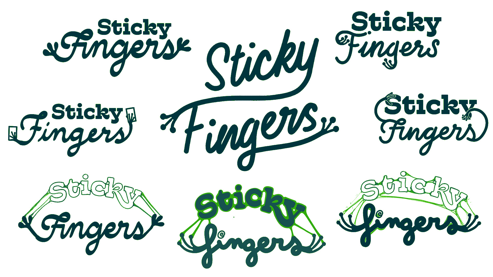
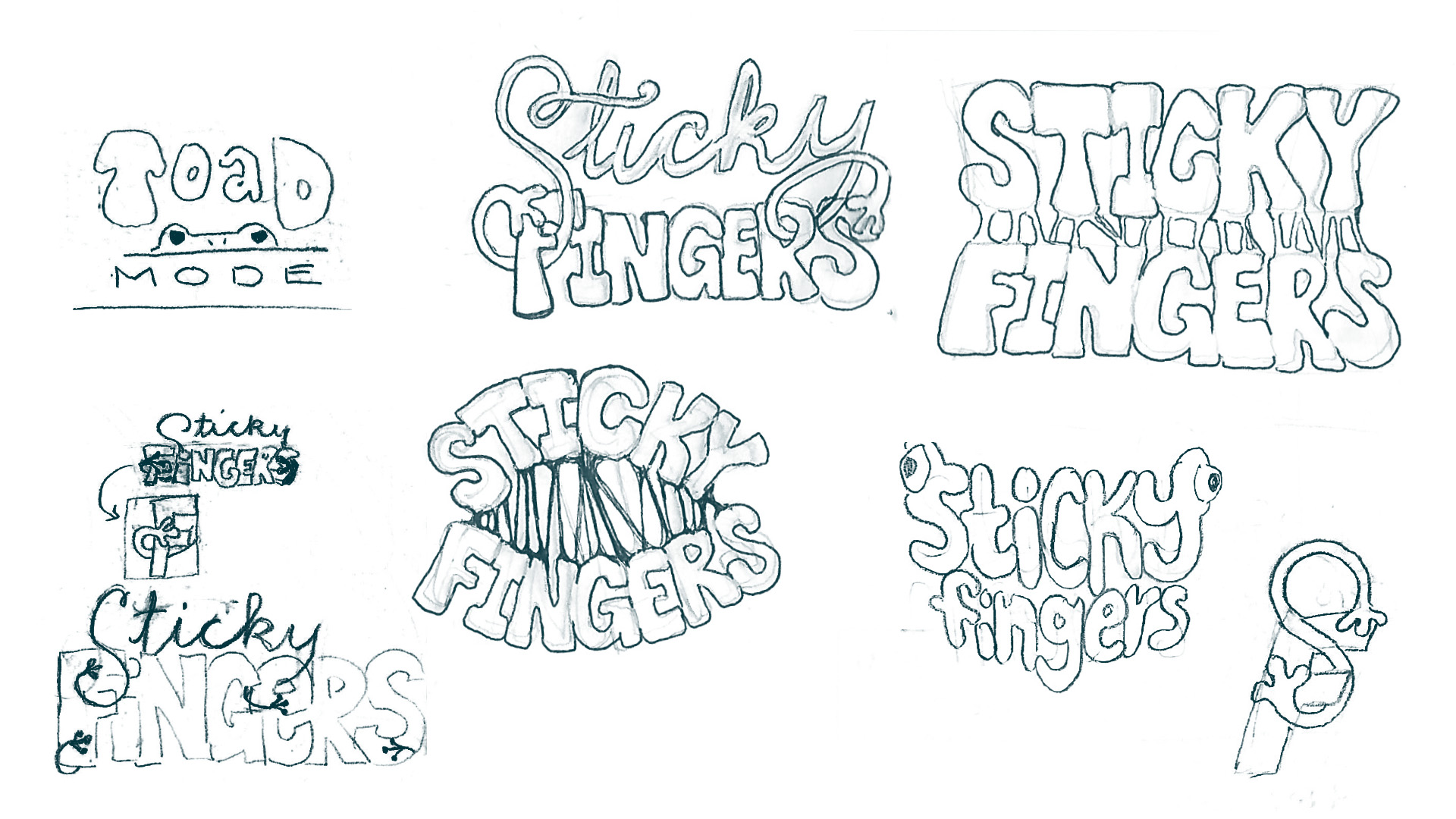
For the main wordmark, I explored script fonts in search of something that would express quickness, and an opportunity to incorporate a visual hint towards frog hands or pond critters. I considered going the icky-gooey route with gooping, clingy letters, and I also attempted warping the title into the shape of a frog. Eventually I ended up with a monolinear script that terminates as a frog hand in two locations: and a ligature that links between the top of the F the tail of the Y.


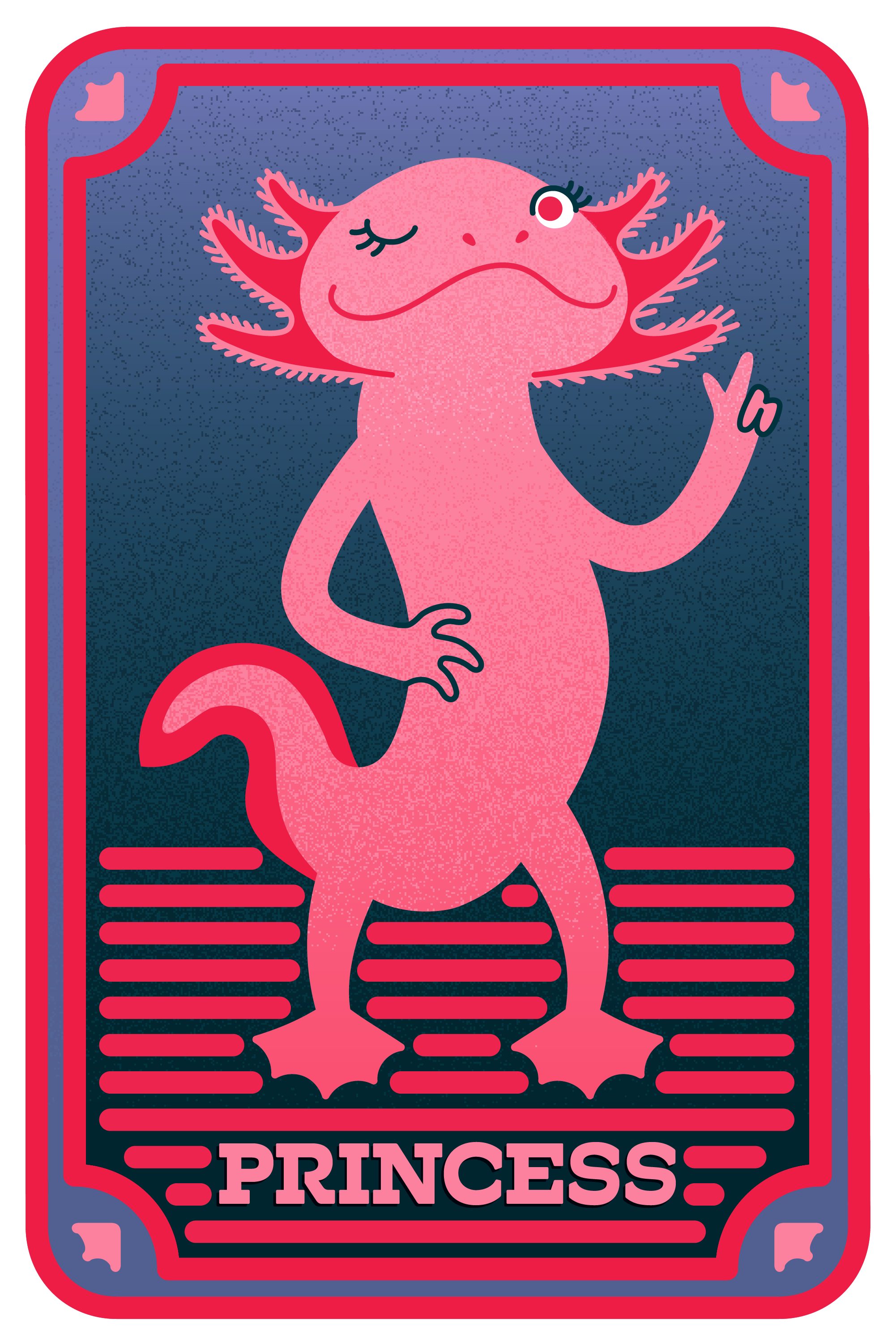
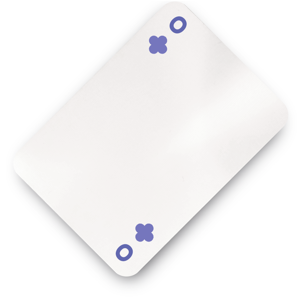
One problem I have faced when playing the original version of “Dutch blitz” is that the colors are hard to distinguish, especially for colorblind players. So, when I chose my colorscheme, I found resources online that allowed me to view how the colors are interpreted by those who are colorblind, to ensure I was using high contrasting colors where it was important. As an additional measure, colors which appear to have low contrast for people with colorblindness were assigned to suits with different symbols, to provide more clarity.
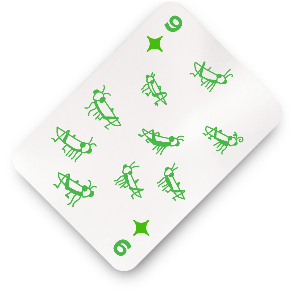

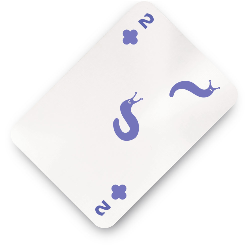

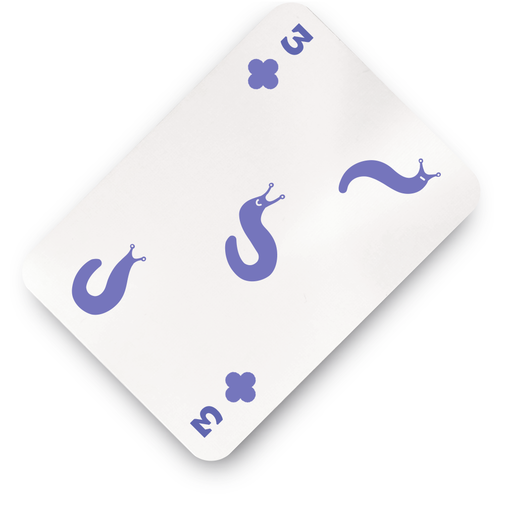
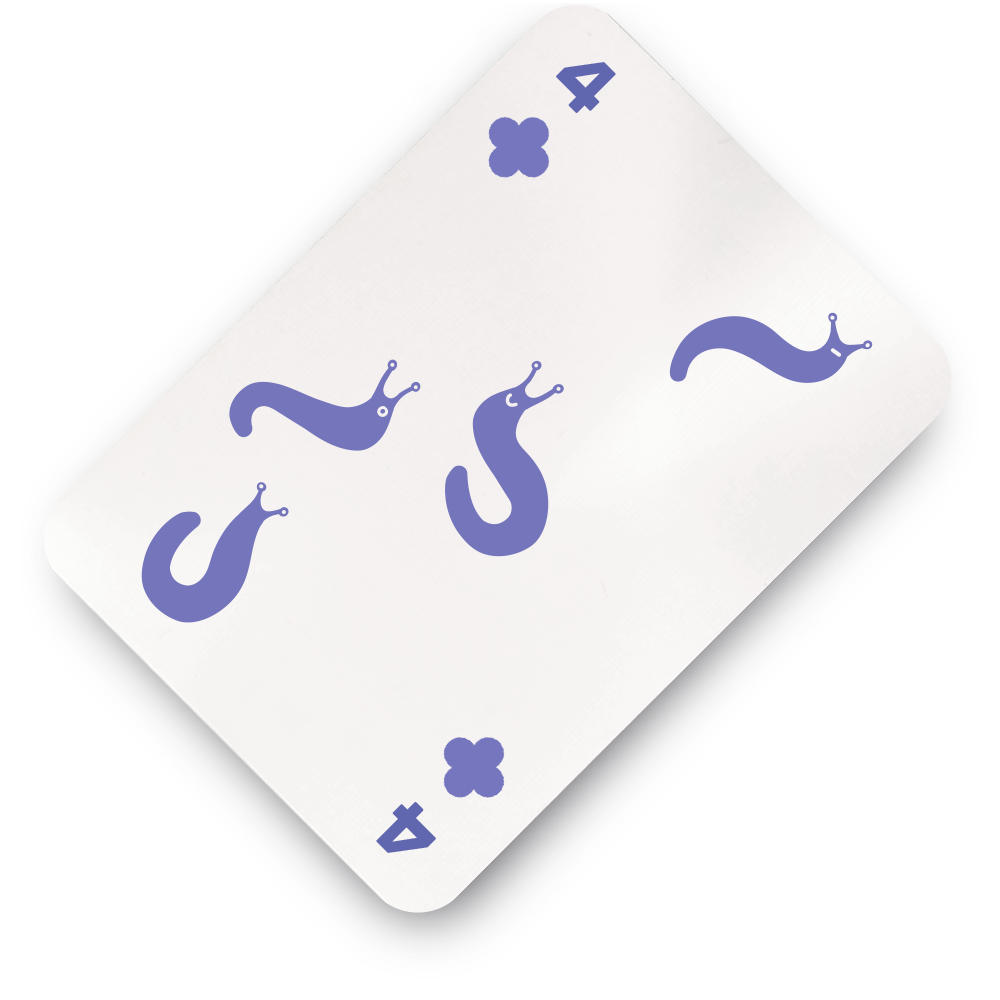
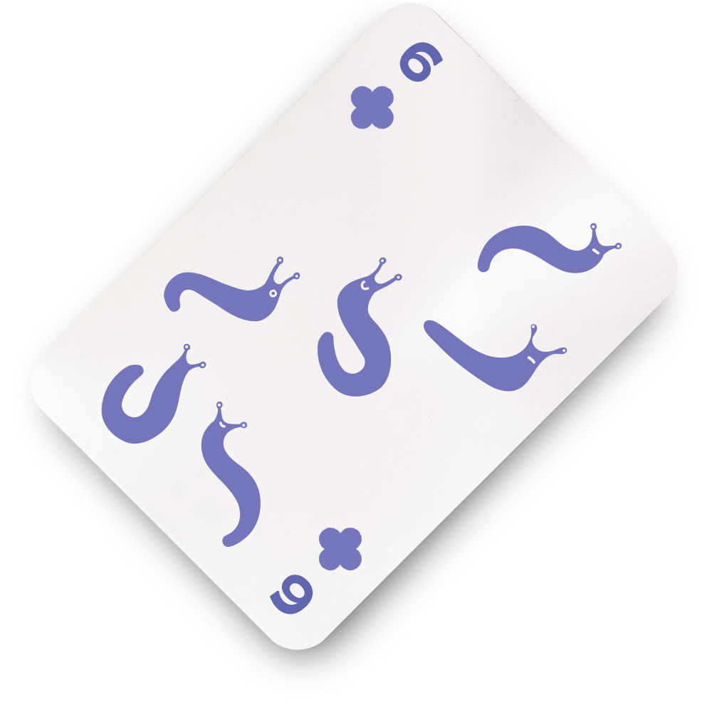
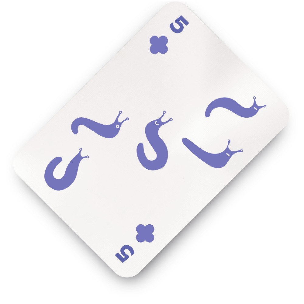
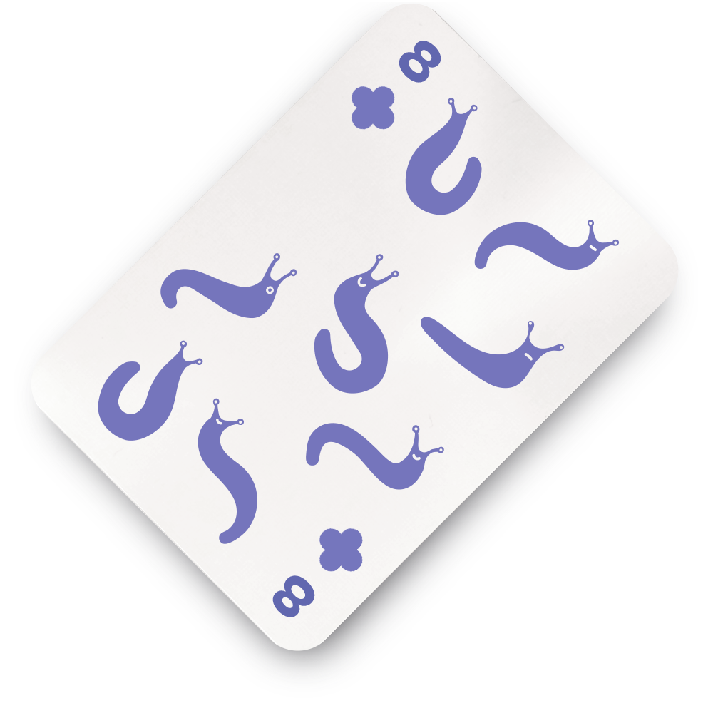
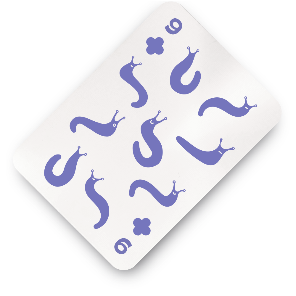

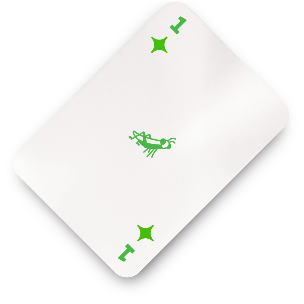

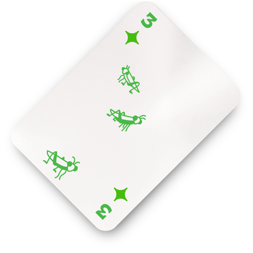
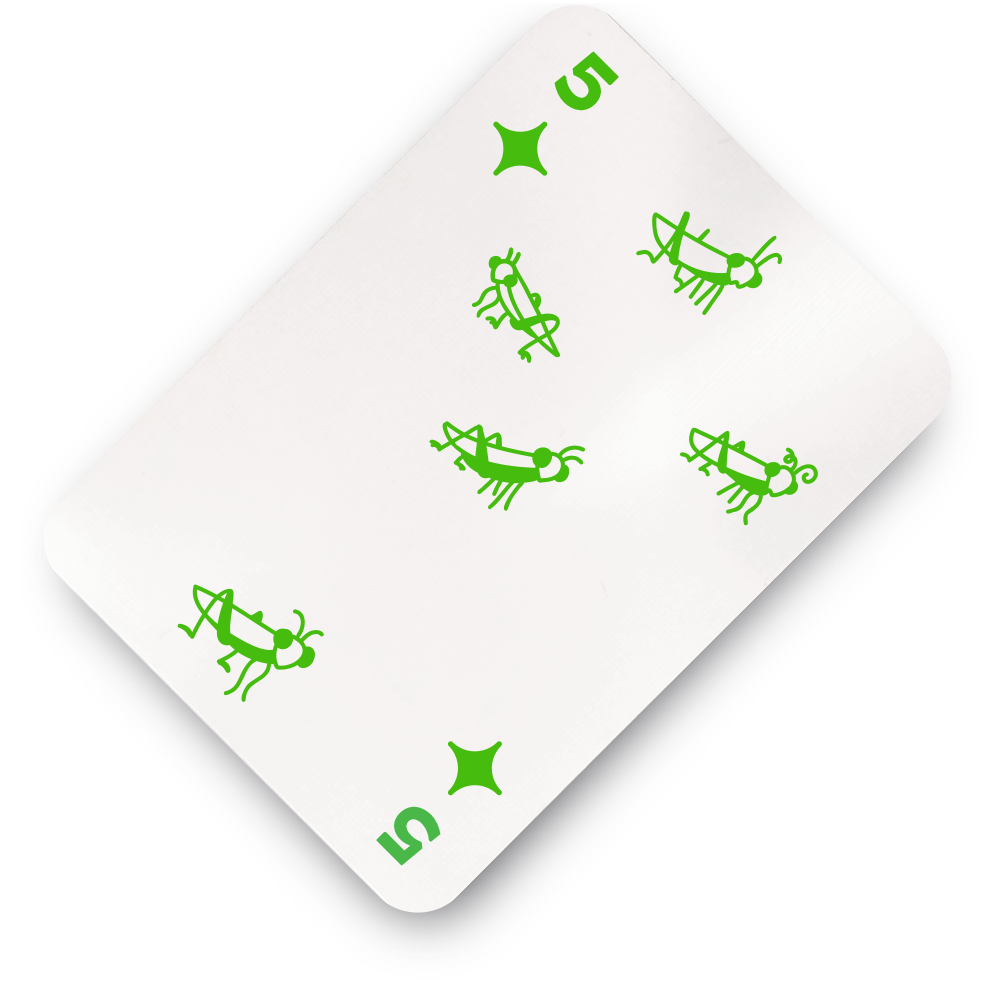
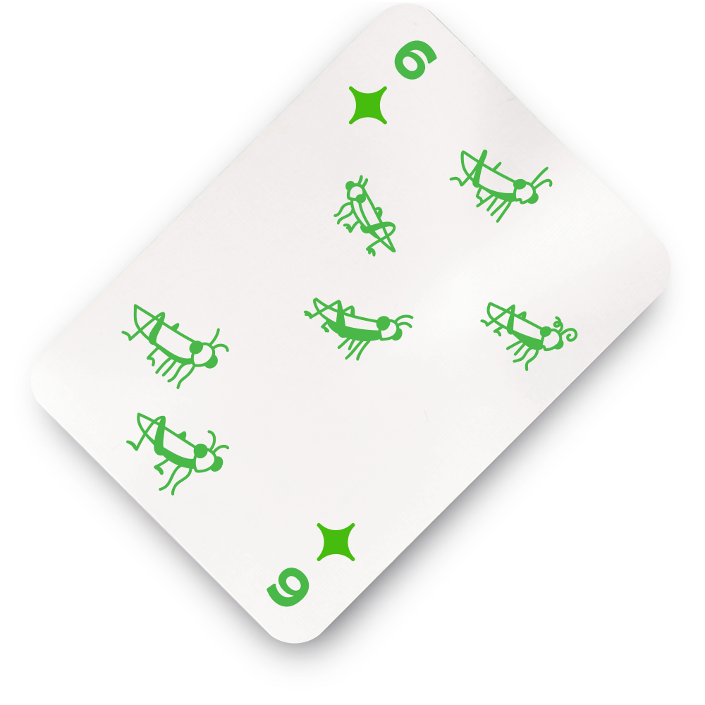
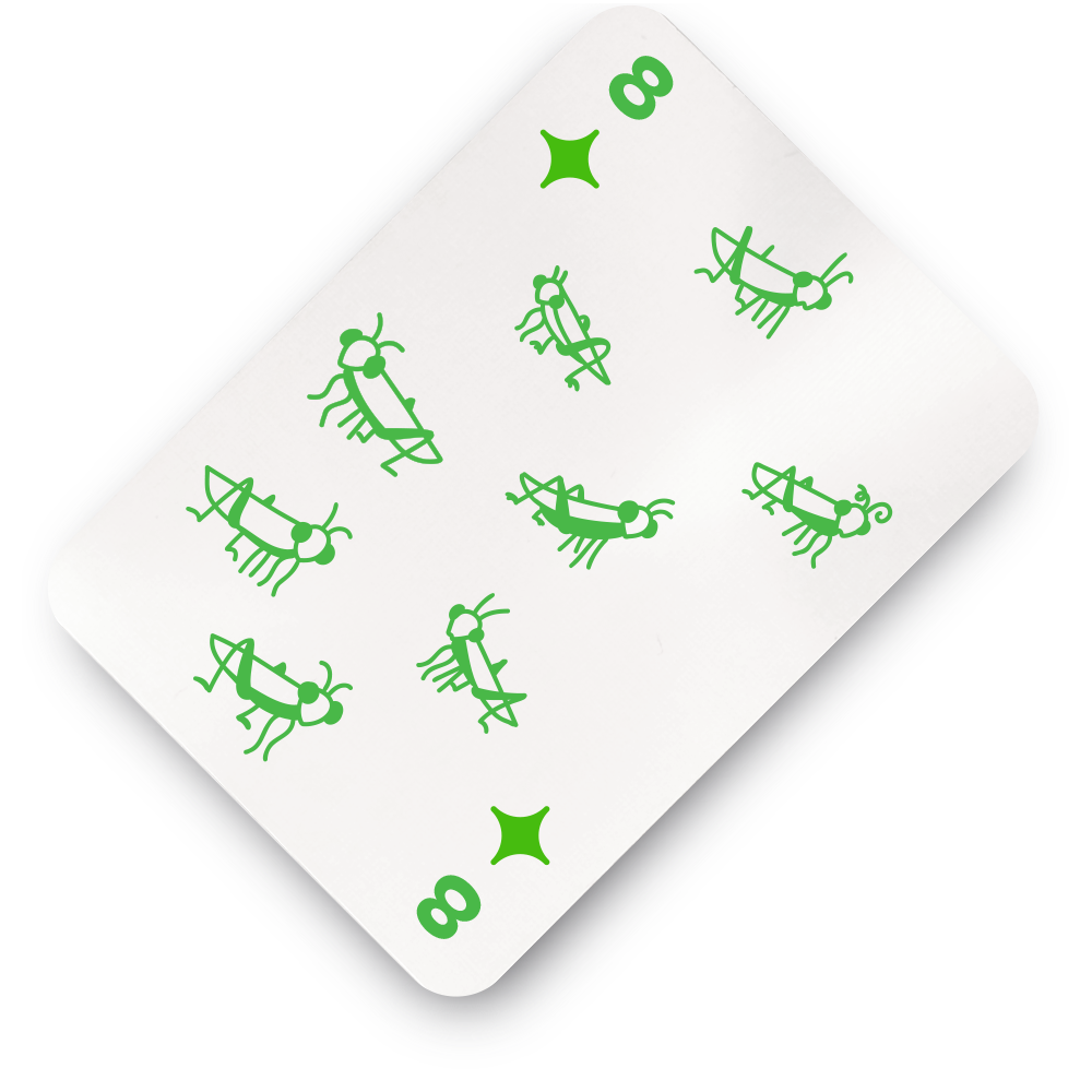
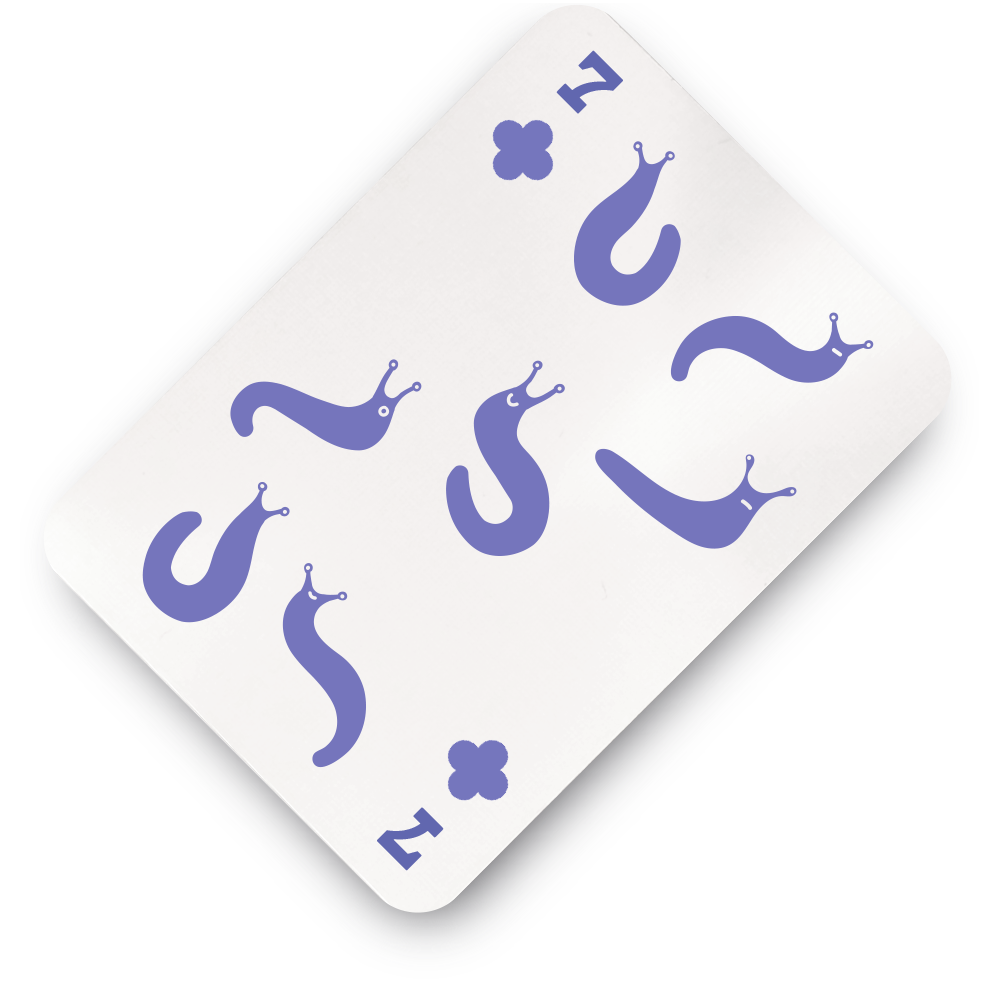
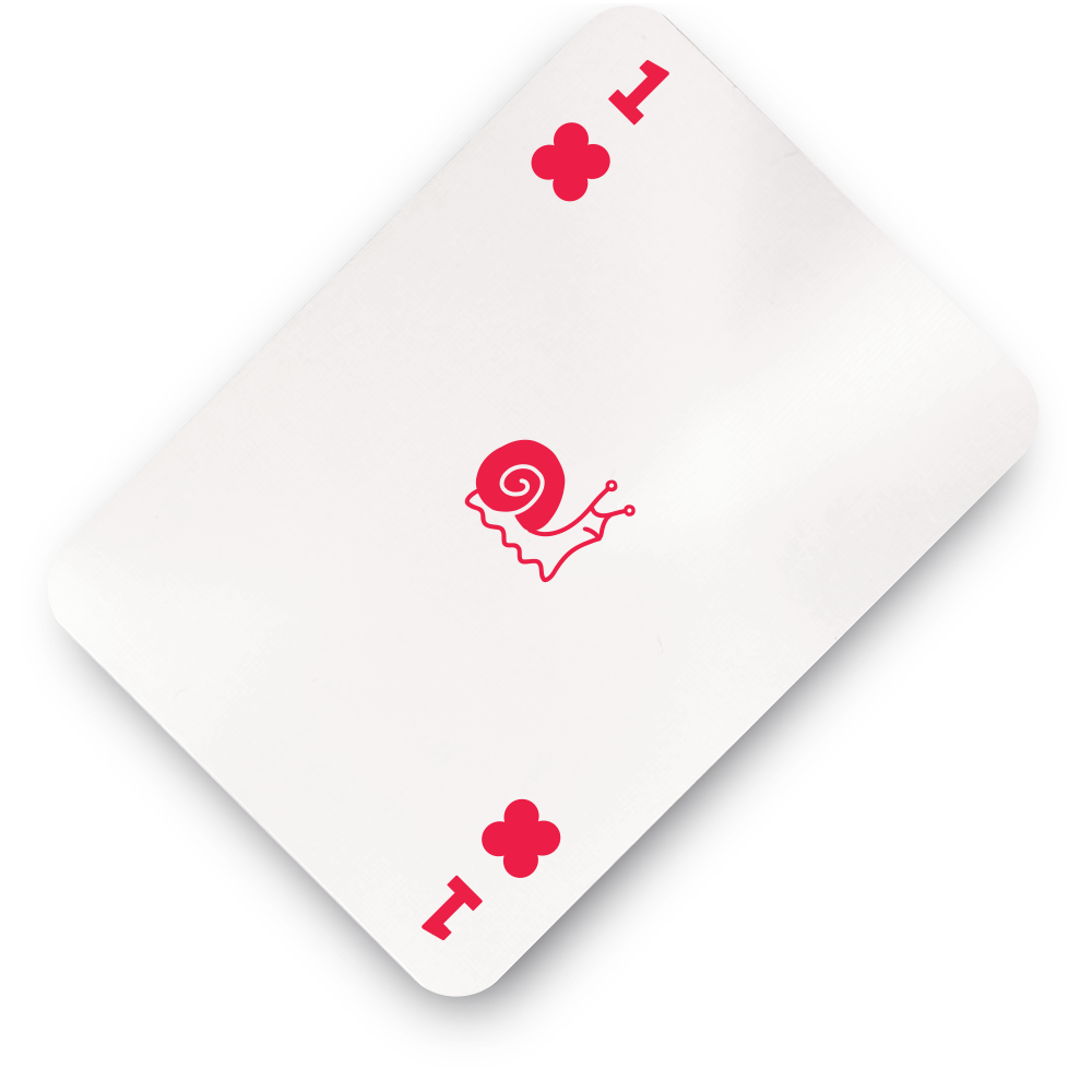
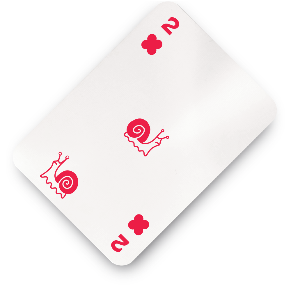
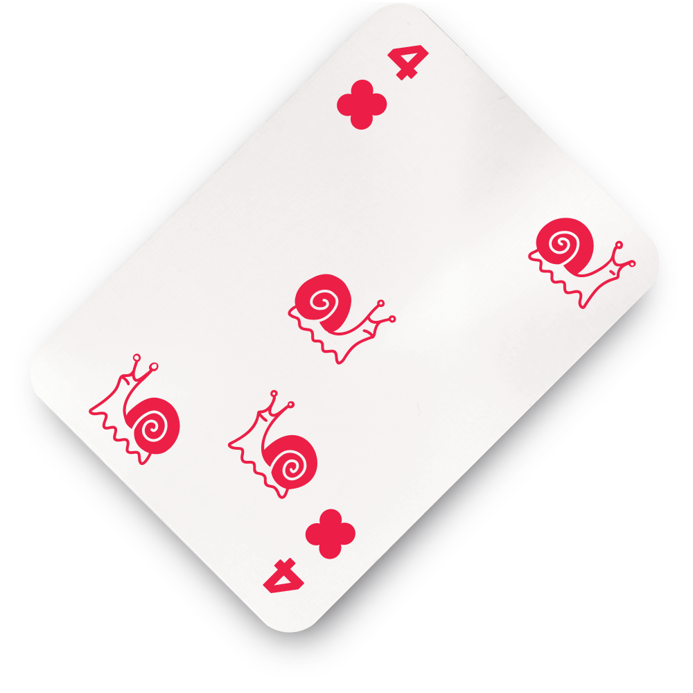
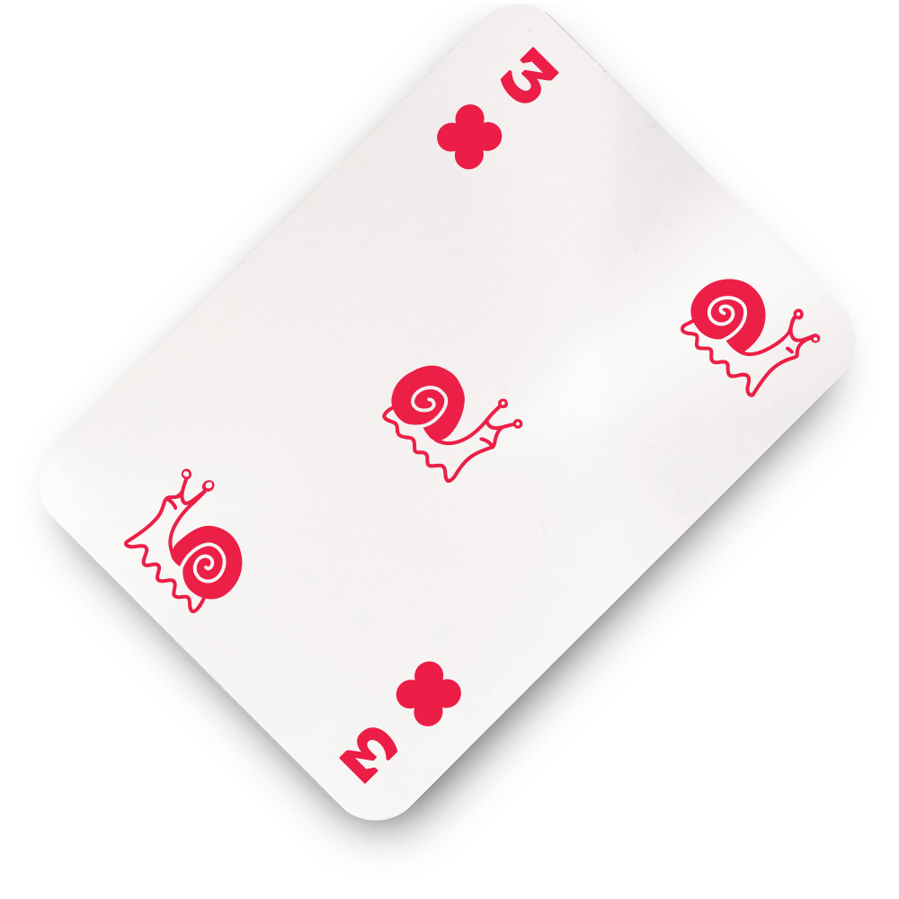
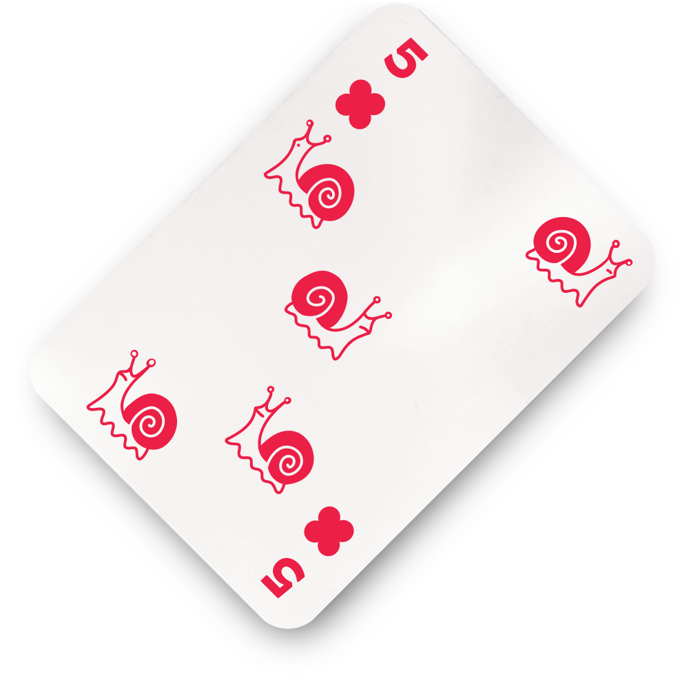
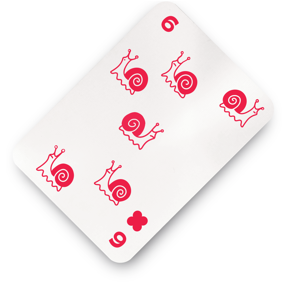
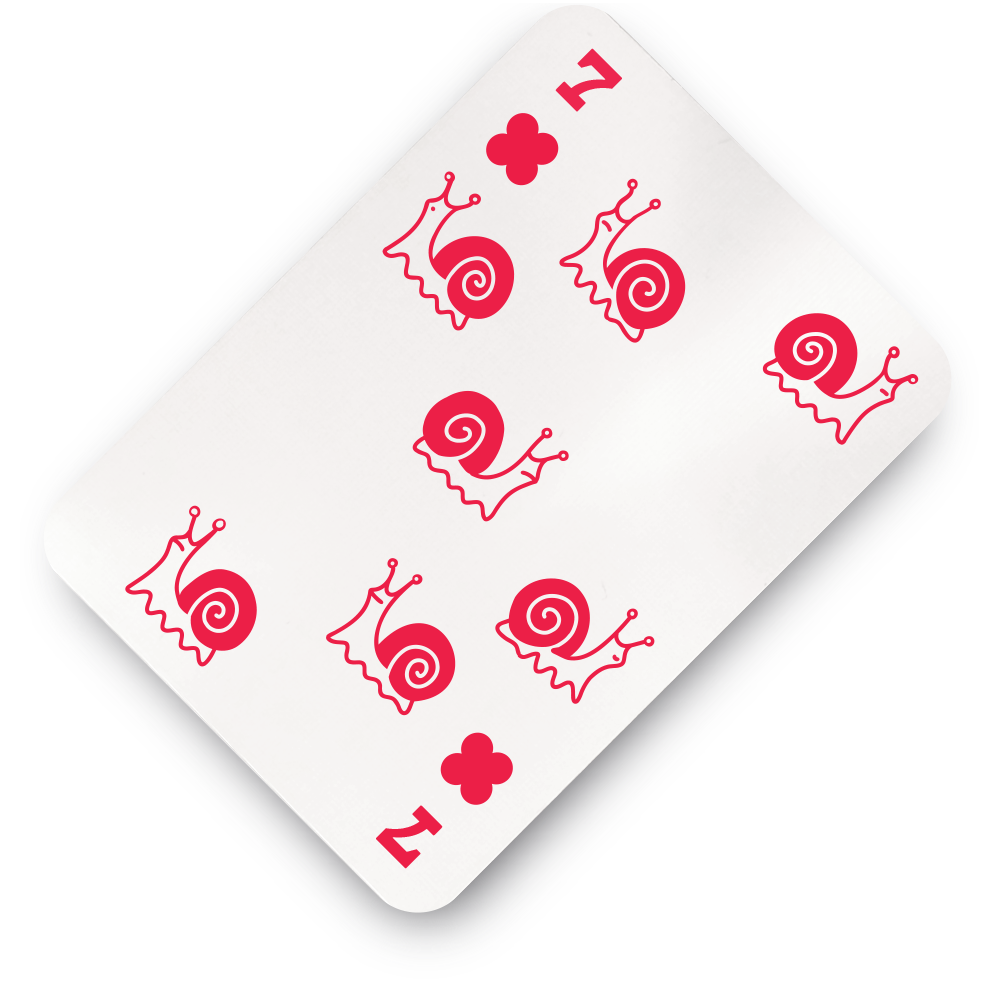

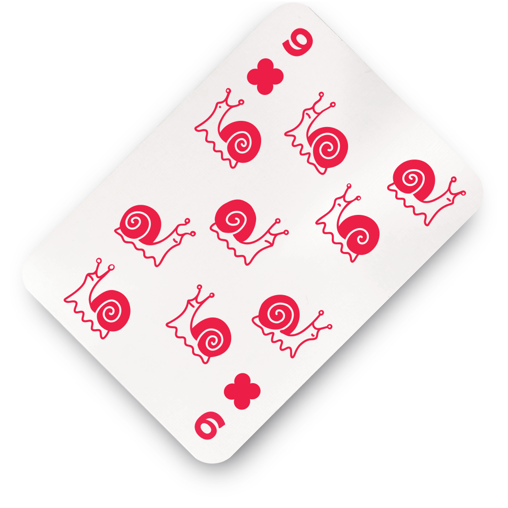
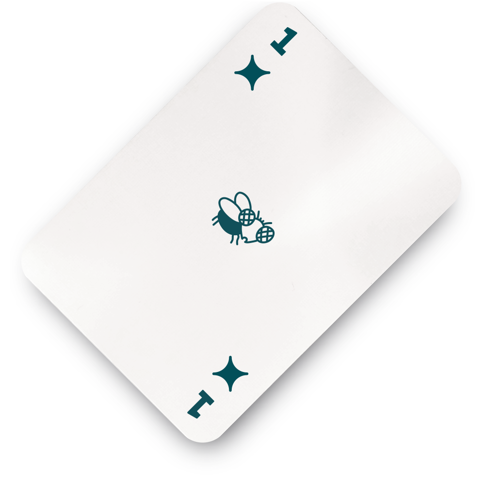
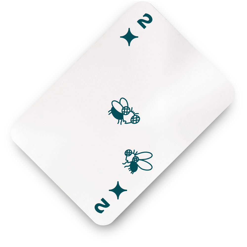
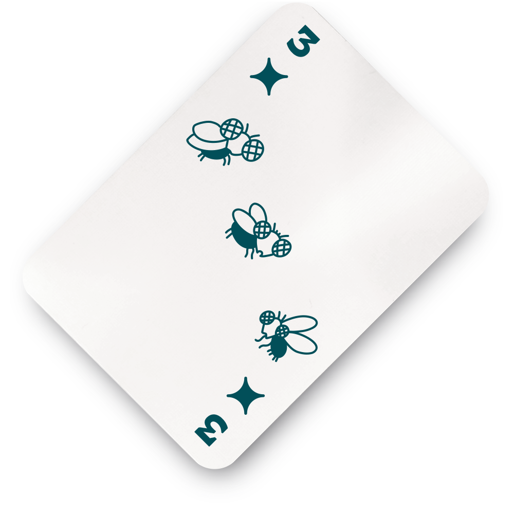
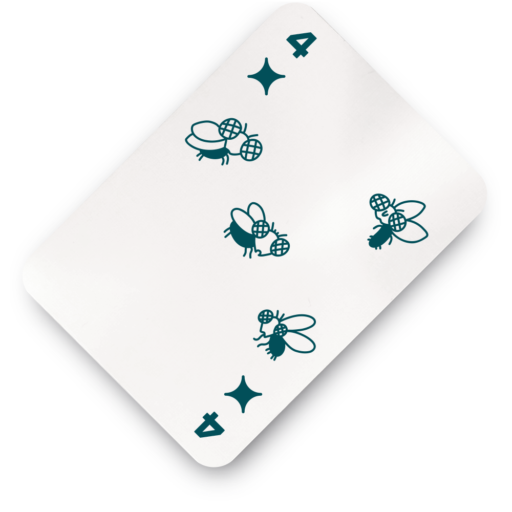

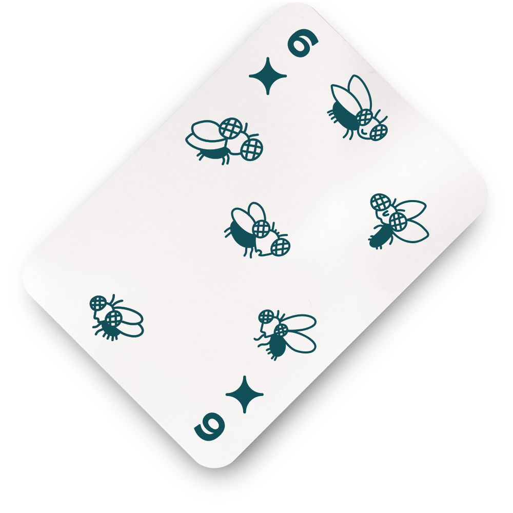
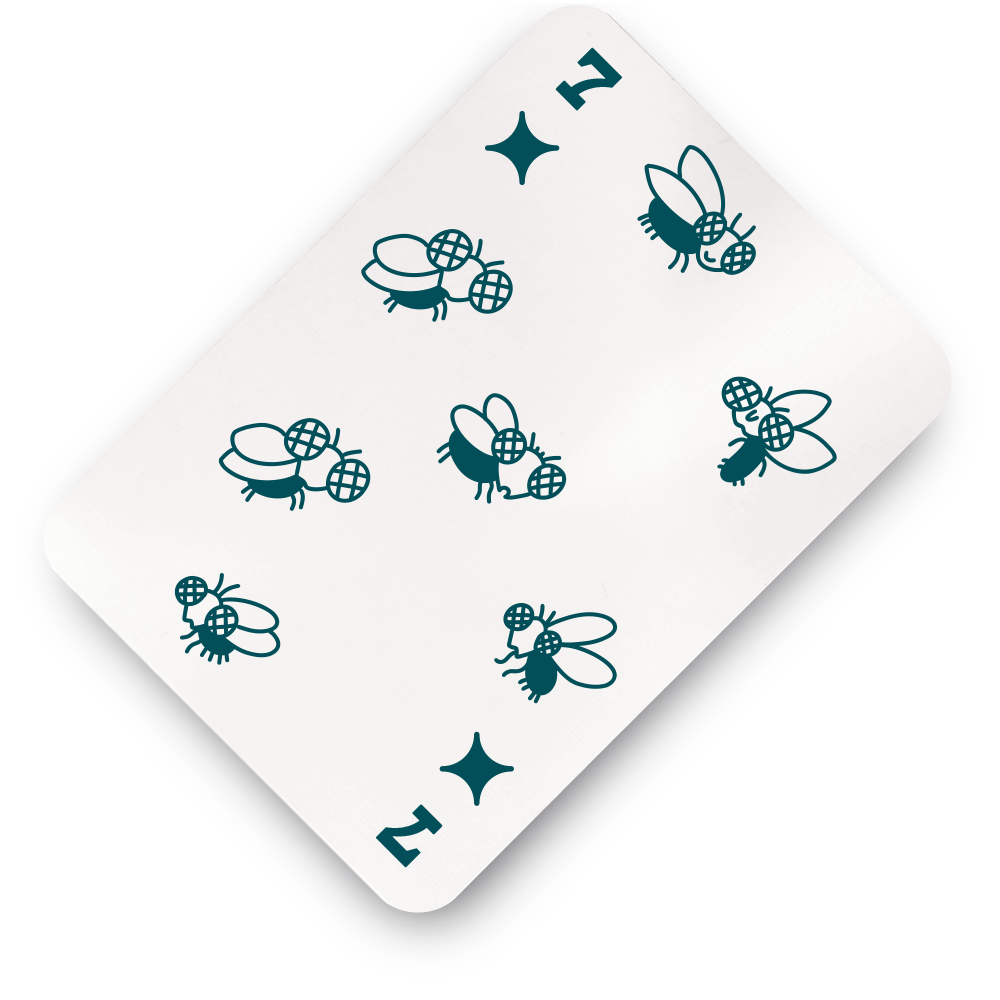
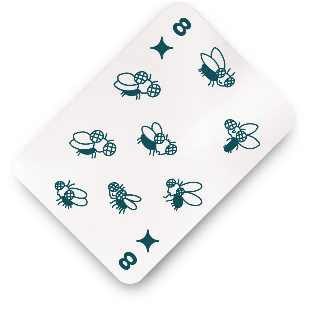
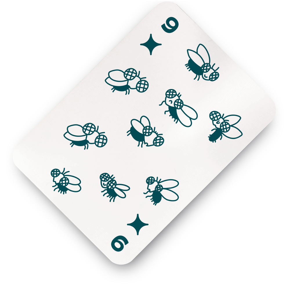
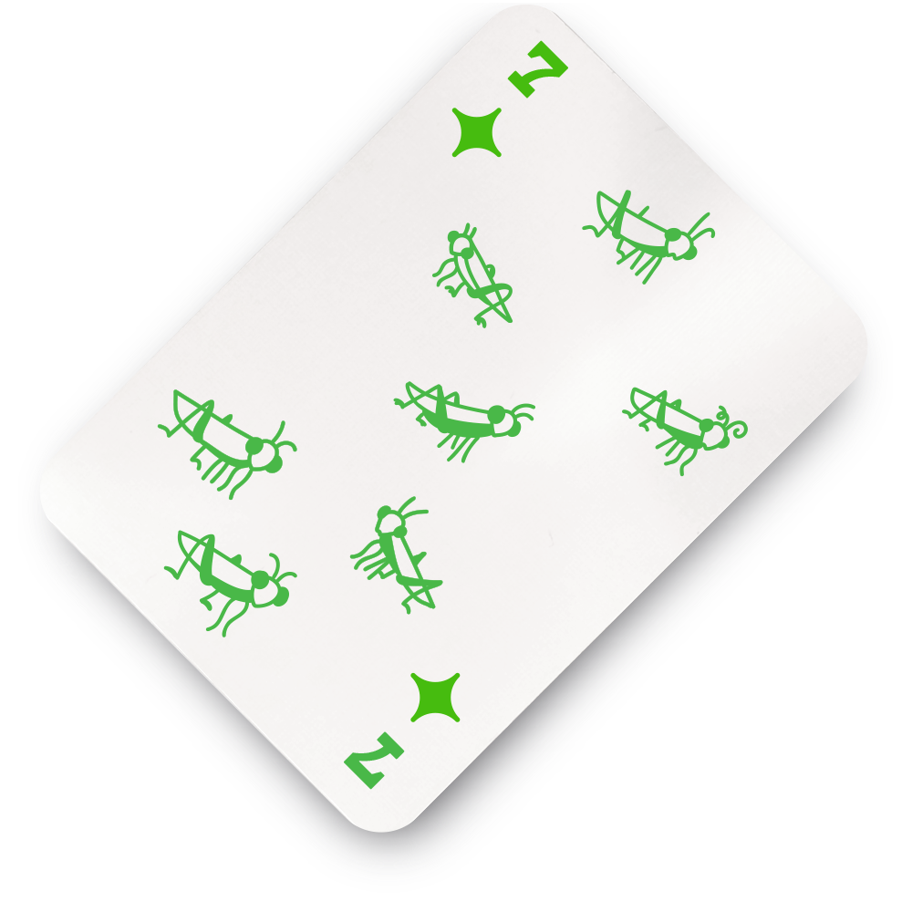
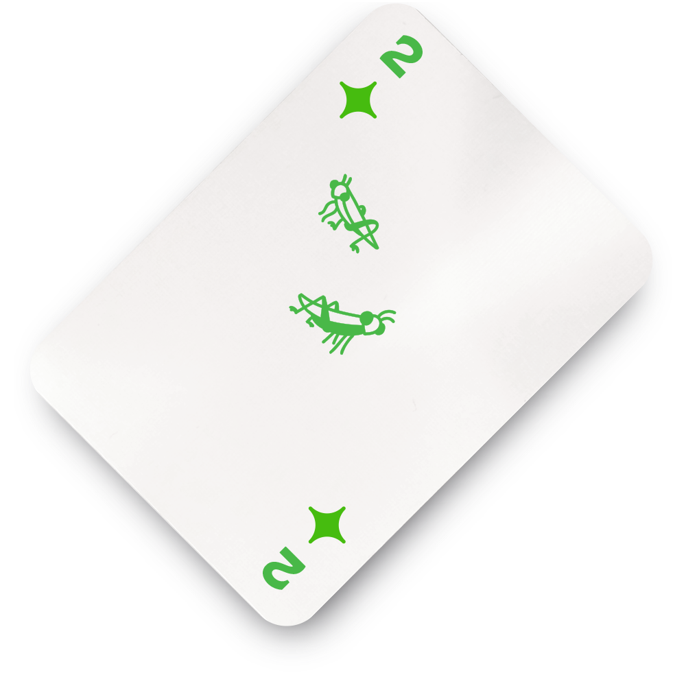
In Dutch Blitz, the yellow and green suits are girls, and the red and blue suits are boys, and the distinction is necessary to understanding the rules. To degender my cards and create more variation, I decided that each color would be its own pond critter (fly, cricket, slug, or snail), and instead of girls and boys there would be insects and gastropods. My depictions of these critters are not anthropomorphized as heavily as the frog “avatars” because it is generally understood that frogs eat bugs and slugs. For each suit, the number of creatures pictured on each card is equal to the value on the card.
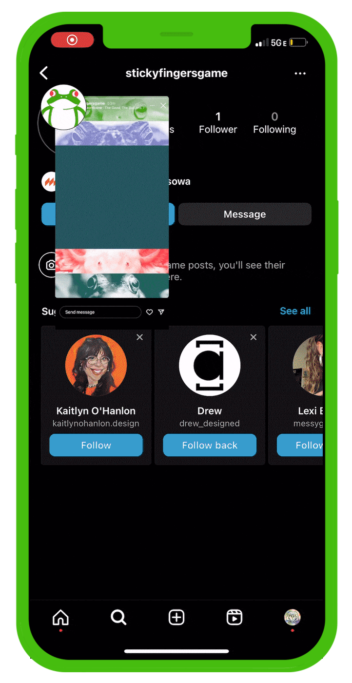

Though I had been drafting a box design since early in the project, the packaging was one of the last deliverables to find a solution. In order to make breakthroughs and overcome artist’s block with this element, I was encouraged to consider what an instagram campaign would look like, to find the voice of the game once again. Putting together a set of instagram stories was an exercise in exploring the conventions of the brand I constructed, and allowed me to experiment with their possibilities. Seeing an advertising campaign come together gave me the vision I needed to add text to the box design and finalize the packaging.
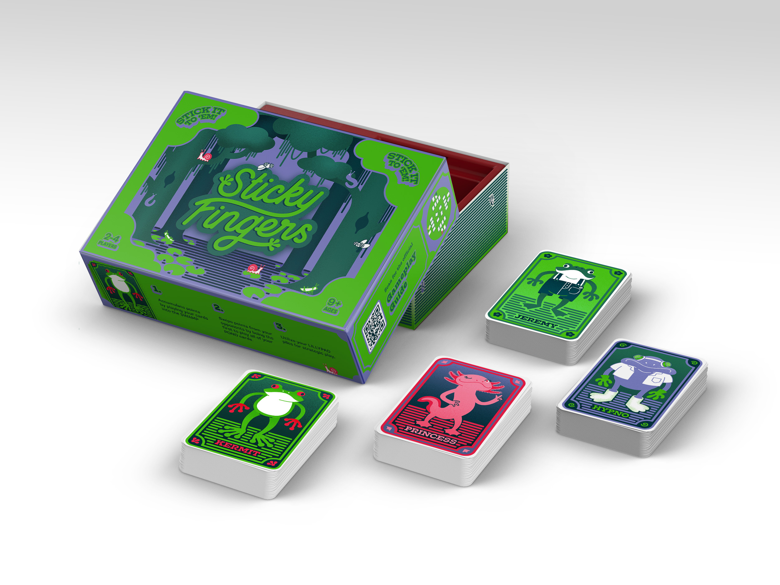

Instead of creating printed instructions for the game, I decided to create a webpage which players can find by scanning the QR code on the side of the box. A digital page for the instructions opens up opportunities for helpful animations or video-guides, and with a code always on the box, players never have to worry about losing paper instructions in the junk drawer. Click here to read the official Sticky Fingers Gameplay Guide.
INSTRUCTOR:
Jason Kernevich
︎︎︎LAST NEXT︎︎︎
