
BEGAL BUOY
BRANDING / CASE STUDY
Meet My Brain Baby: It’s a Buoy!
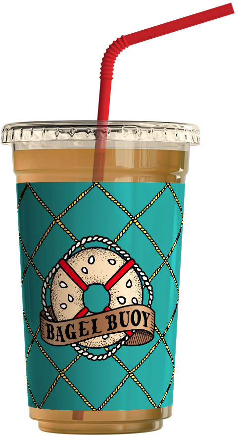
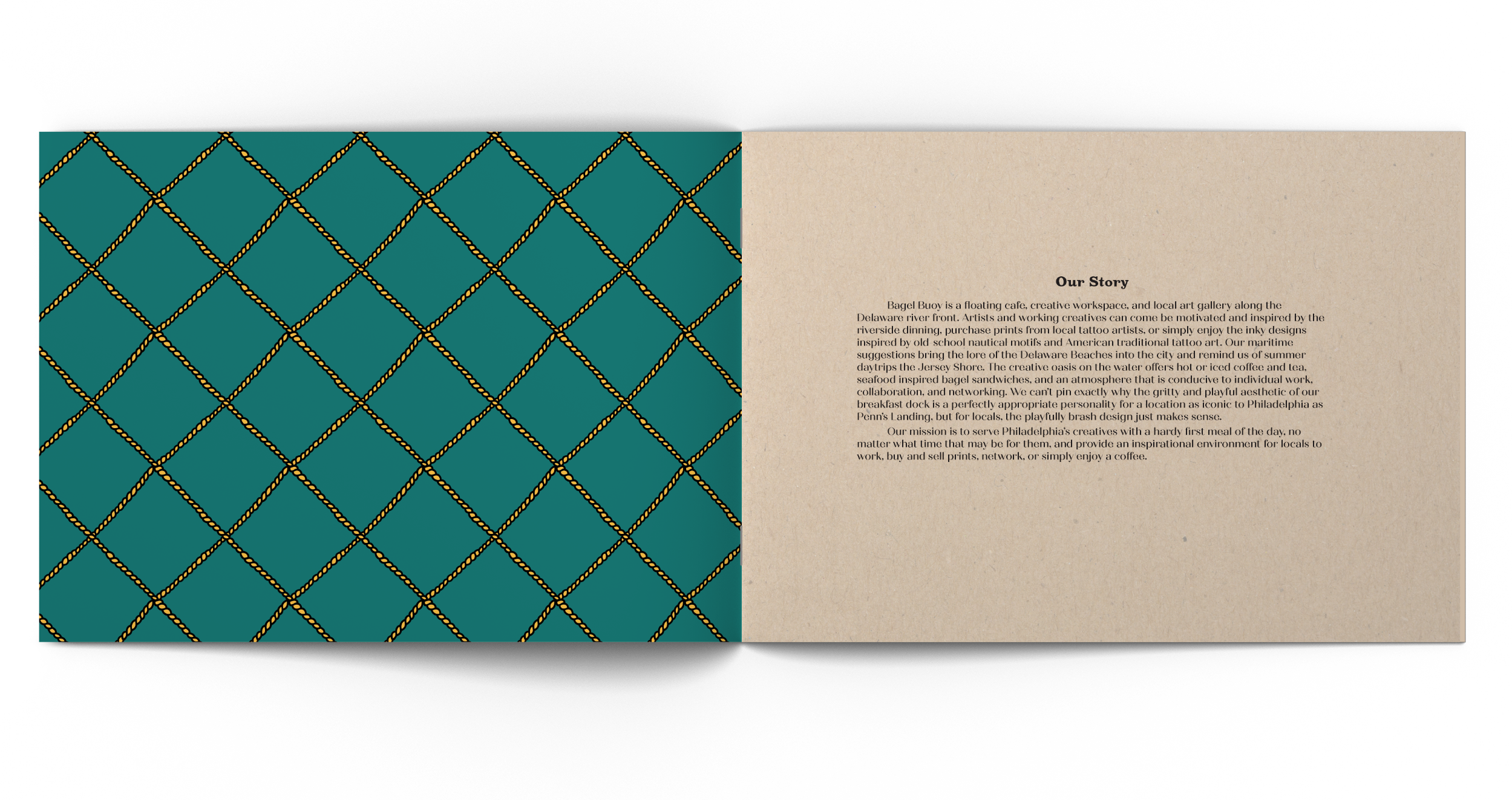
Bagel Buoy is a cafe and creative workspace in Philadelphia, along the Delaware riverfront. Come be fueled by our riverside dining and enjoy the inky artwork inspired by old-school nautical motifs and American traditional tattoo art. Our maritime design brings the lore of Delaware and Jersey beaches into the city and reminds us of summer trips down the shore. The creative oasis on the water offers hot or iced coffee and tea, seafood-central bagel sandwiches, and an atmosphere conducive to creative work and networking. Philadelphia is the City of Brotherly Love, but we love Philly for her bold edge. The complementing personality of our breakfast dock suited the iconic location of Penn’s landing, where locals and visitors can come experience the welcoming grit of Philadelphia with our playfully brash brand identity.
Our mission is to serve Philadelphia’s creatives with a hardy meal and provide an inspirational environment for locals to create, network, or simply enjoy a coffee.
Idea Formation: By Pennsylvanians, for Pennsylvania.
Perhaps I have my hometown to thank for the conception of this idea; Being raised in Wawa, PA meant that Sizzli breakfast sandwiches were a staple of my diet. With bagels as my choice breakfast sandwich bread, I began playing with the alliteration opportunities of “bagel,” “breakfast,” and “boat.” At this time I had a vision of the juxtaposition of ring-shaped life preservers and bagels, and the logo was begging to be designed. The personality of the brand came to me at Philadelphia's Annual Villain Arts Tattoo Convention. Adding inspiration to my brand from traditional American nautical tattoo motifs would provide the opportunity for me to display illustrative strengths, give the brand a unique and philly-appropriate character, and link the branding to the seaside location.Savory bagel sandwiches, the Schuylkill River, and sailor tattoos came together as one fluid concept in my mind, and Bagel Buoy was born.

Design Decisions: Primary Palettes for Permanent Impressions, and Timeless Type for a Traditional Take.
Once I had settled on a concept for the visual identity and began studying countless flash tattoo sheets, many of the brand decisions became clear to me. For example, I knew a muted primary color scheme would be imperative because ink colors were limited when the style of American traditional tattoos began to form, and it was challenging to get a brightly saturated color to last on the skin. Similarly, the inclusion of grainy, neutral-toned paper seemed appropriate for evoking the look of flesh-toned textured paper, popularly used for flash tattoo sheets.
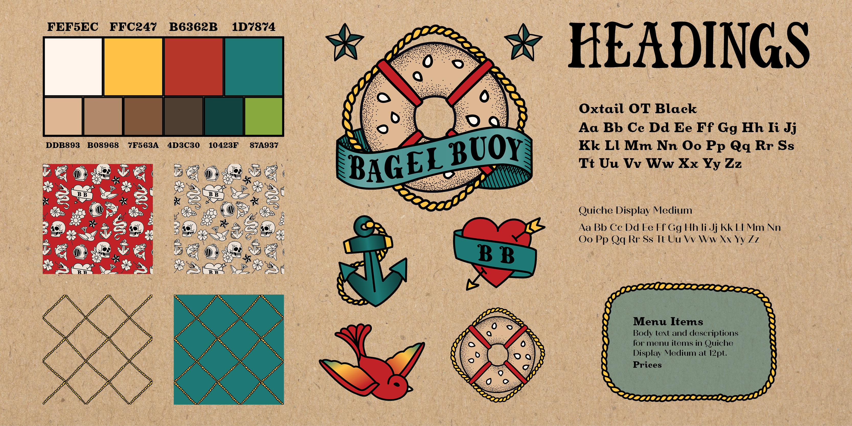
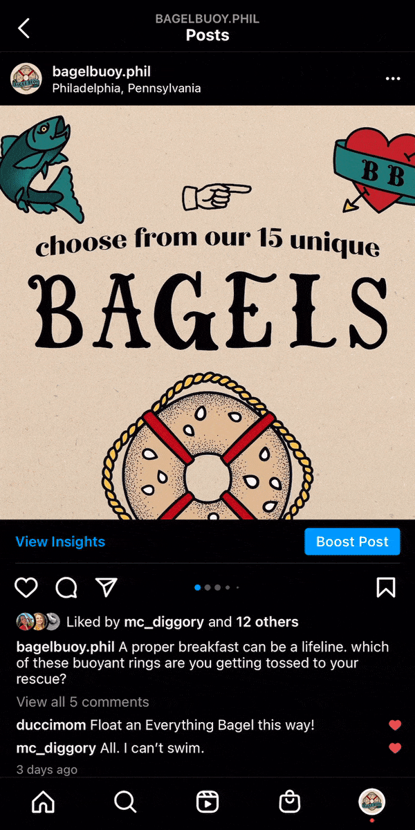
Once these decisions had been defined, I could nail down the logo, which floated through several sketch phases. As I have mentioned before, the choice of imagery was very clear: a bagel as a buoy. I tried a few compositions and angles and eventually landed on a straight-forward birds-eye view, similar to an emblem, with a wrapping banner to evoke dimension. This iteration of the logo was the most successful because it was immediately recognizable at any scale, and both the bagel and the banner functioned as responsive variations.

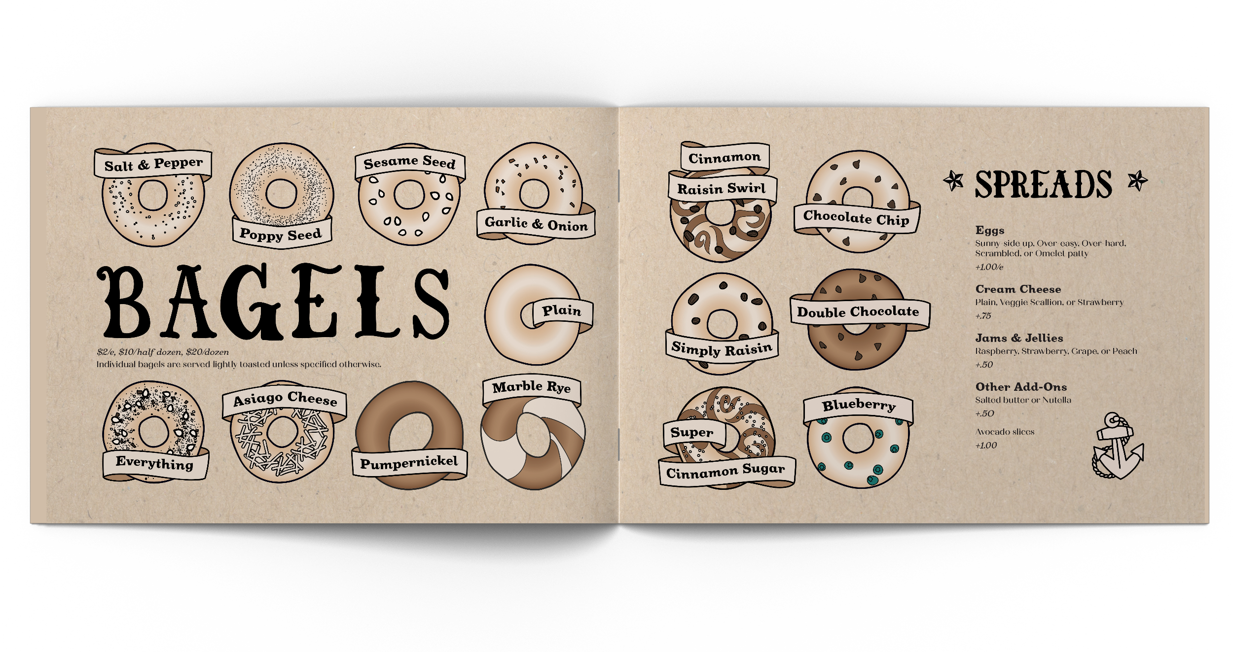
Deliverables: Rough Seas Taught the Tough Sailor
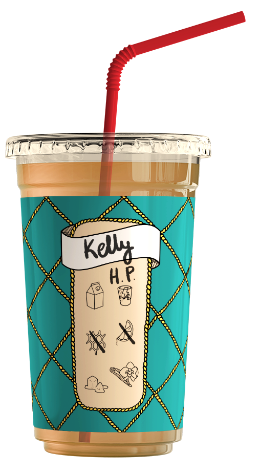
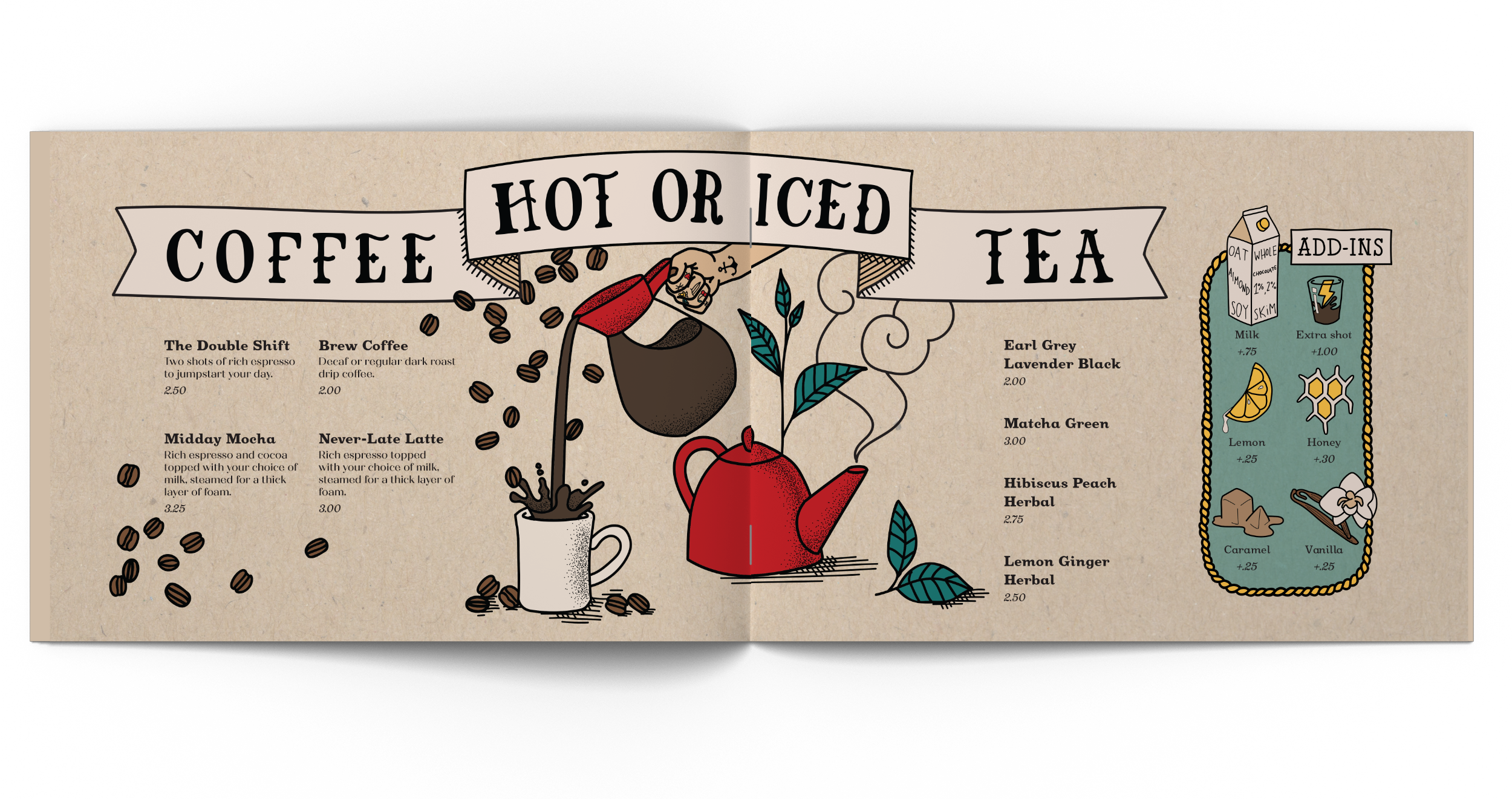
I felt it would be appropriate to design a multi-page menu, to relate the experience of choosing and ordering food to flipping through a tattoo artist’s portfolio. Developing the components of the menu was no small feat, however, spending a lot of time on this deliverable solidified the type treatment, and created a library of illustrations that would return to make more appearances in my collateral. For example, icons that accompany each “add-in” on the beverage page make another appearance on my cups, intended to be marked off by the barista according to a customer’s order. For the sake of continuity, it was important that these smaller details were created with the same level of attention as the bigger, more central illustrations.
![Menu: Opening Spread]()
![Menu: Beverage Spread]()
![Menu: Begal Spread]()
![Menu: Sandwich Spread]()
![Menu: Front and back cover]()
![Menu: front cover]()

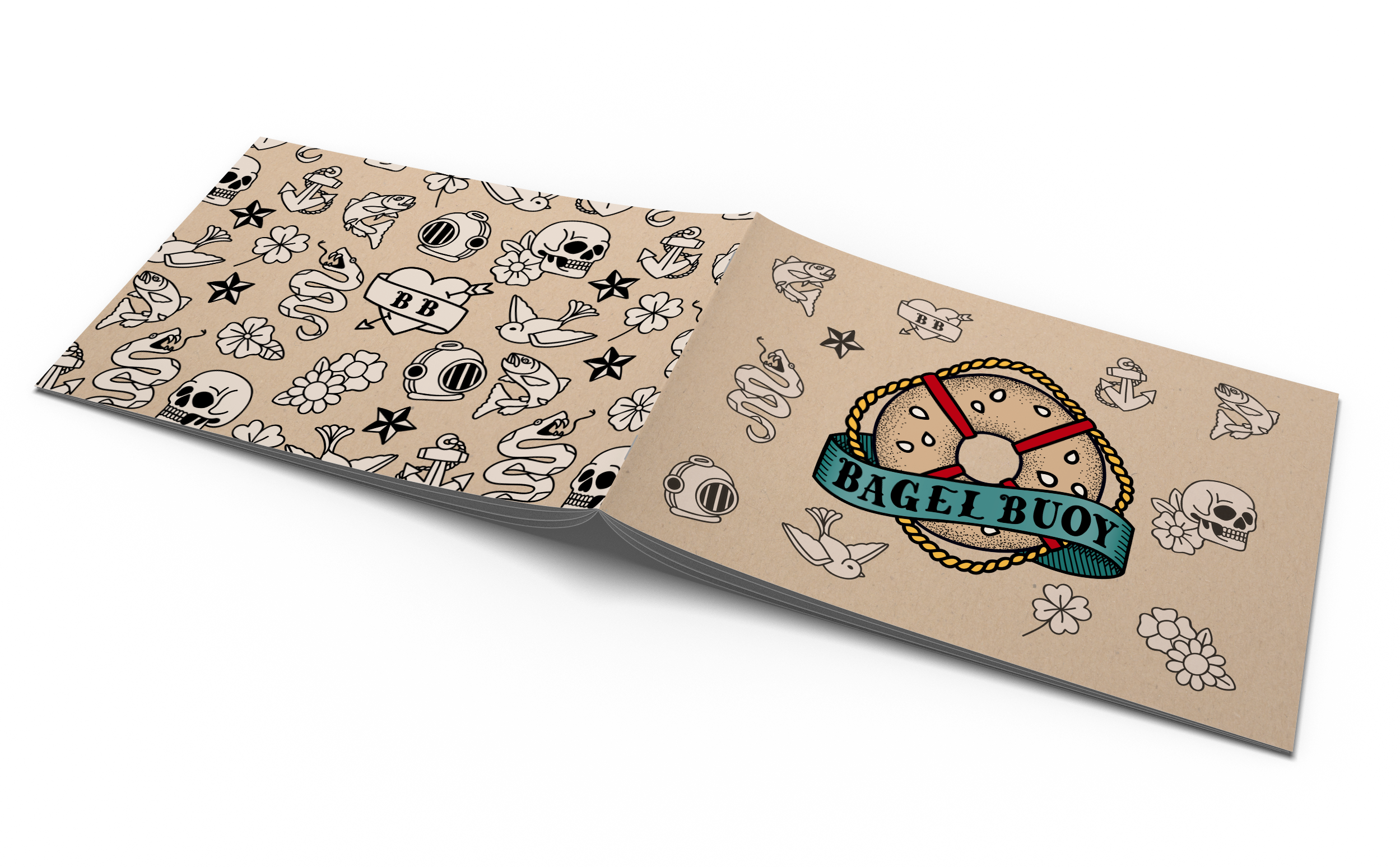

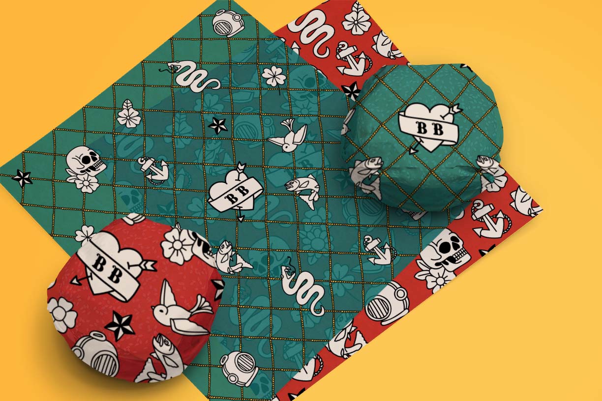
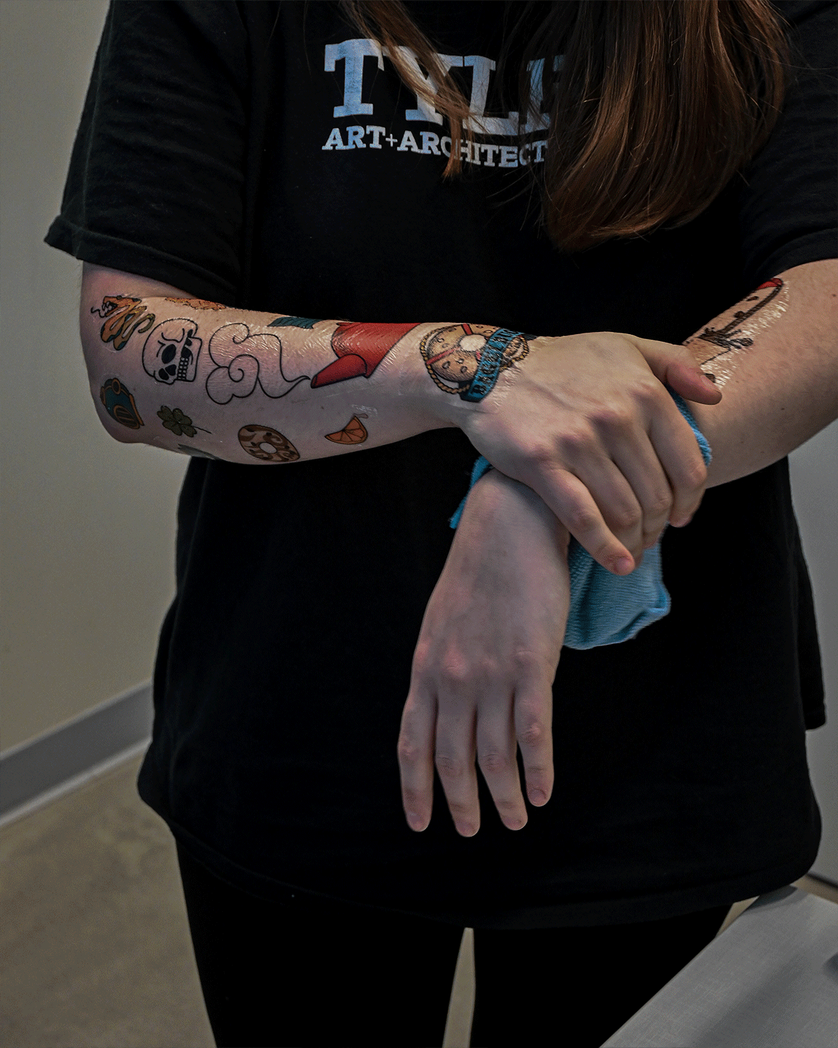
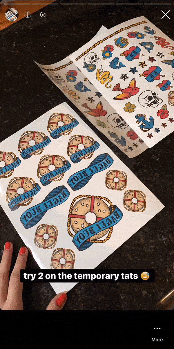
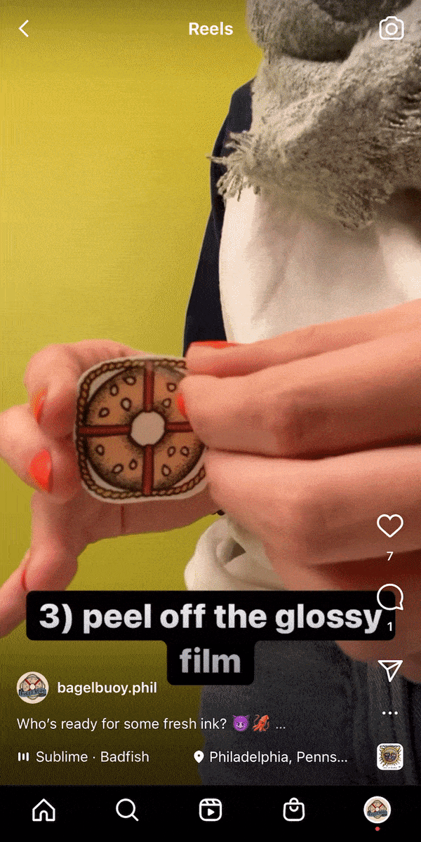
Another repeating element from the menu is the classic flash tattoos on the front cover of the menu, which repeat in a pattern on the back cover. The pattern was used again in combination with the brand colors for the two sandwich wrap designs. These pattern elements, along with the logo and other drawings pulled from my menu, became the designs for the temporary tattoos, which would serve as a way for customers to show their Bagel Buoy pride, and interact with the Bagel Buoy Instagram account.
![Gif showing two models wearing temporary tattoos with designs from the brand.]()
![Five temporary tattoo sheets]()

I chose an Instagram campaign as my digital deliverable because Instagram is another space for creatives to share their work and support other artists. My intention was that Bagel Buoy’s Instagram would engage its audience by encouraging customers to share photos of their temporary tattoos or comment about their favorite type of bagel.
![]()
![]()
![]()
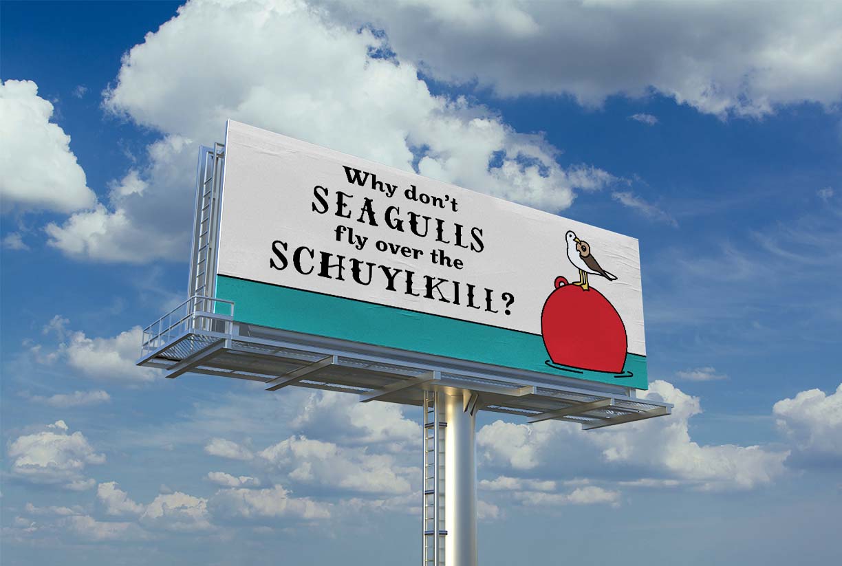
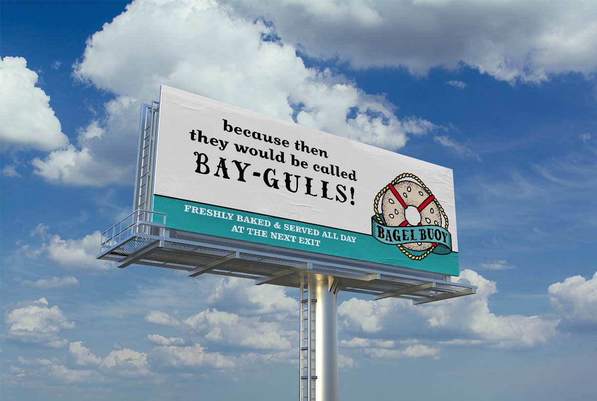
The Future of Bagel Buoy: Where Will We Float Next?
The potential for more humorous and philly-fitting brand components was far from exhausted when I completed this project. There are still literary opportunities hidden in the cross-sections between Philly jargon, breakfast words, and sailor speak. With more time to brainstorm, plenty more witty quips fir for T-shirts and subway ads would begin to surface.
While compiling my images for display, I noticed that my friends and fellow artists thoroughly enjoy the personality of Bagel Buoy and are proud to wear the brand’s temporary tattoos on their skin. One of my original ideas for a deliverable was brand apparel, and I think given the positive feedback of the tattoos, T-shirts, sweatshirts, and beanies would also be a hit. Merchandise such as bumper stickers, refrigerator magnets, and tote bags could serve as another form of income for the shop, as well as promote word-of-mouth advertising. But with new projects on the horizon, I felt my voyage with Bagel Buoy had come to an end, and I navigated the project back to shore.